Комментарии:

That's my pops
Ответить
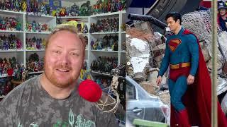
I love everything about this suit! To me it is perfect. I love how they taken the designs from the comics & combined it together. It's new, comic accurate, also got that classic vibe with some of the iconic design & colors.
Ответить
Things I personally dislike about JG’s new suit:
- Its ill-fitting;
- ankle length cape
- the trunks
- the belt
- too bright
Hopefully they fix all that in post. I know it’s inspired by the comics but Henry Cavill’s suit still is unbearable. If they re-used it with just a little more color it would be iconic.

That Suit Is atrocious and it's Not Because of the trucks. it's lose and very unflattering what were they thinking. It looks Like Bad Cosplay.
Ответить
Glad S is on the cape, but agree that I would’ve like a more s shaped S. Like the red and blue but think the yellow is to muted and doesn’t match well with other colors. Hate all the lines on the suit.
Ответить
I like the look, but the fit seems off. They need to make sure it is far more fitted so Supes doesn’t look like a soup sandwich.
Ответить
It's not an S. It's a crest.
Ответить
James Gunn could have gone for a different design for the red trunks if he was going for a futuristic look. The pants could have made it look like trunks but in a design which incorporated the yellow belt. The red trunks to me does not match this suit. It looks odd. The cape could have veen made a little shorter and it would make David look bulkier/ bigger. The cape could have gone down to half the calf area.
Ответить
I absolutely love the colors. Bit I don't like the ill-fitting "wet suit" material. Also those gigantic trunks look more like super Depends, as opposed to properly fitting trunks. I love the yellow S on the cape, always have. But I'm not a fan of the Kingdom Come S either.
Ответить
Can you do a display showcase video?
Ответить
Like the S on cape, belt and trunks. Would’ve preferred more classic S symbol, no collar and none of the lines all over the suit.
Ответить
I'm really loving the new suit
Ответить
Regardless how comic accurate whatsoever.. for me it’s downgraded from Cavil.. the level of the outfit like CW or mediocre movies gonna be.. Bit bias maybe, bcoz I’m Snyderverse fans. But really looking forward for this movie.
Ответить
I don't love the line work but I do like what they got going on with the suit material wise. I don't think its going for an armor look, rather it reminds me of like flight suit material.
Ответить
My thoughts are in the middle I have to see it on the big screen but I'm really excited for the movie. Now can you talk about the Lois Lane the actress looks perfect fantastic choice 👌
Ответить
I like the color and everything I just HATE the thickness, it’s almost like Guardians of the galaxy outfit
Ответить
I would have preferred a short cape, but I still love the overall look. The trunks are good, the collar is fine for me. The guy smiles and that's the best part.
Ответить
Gunn suit really looks bad
every live action suit, from the oldest movies to the most recent show, it looks good on every bts shot. Gunn's suit doesn't.
it's what i've been fearing, Gunn has ONE style of filmmaking, and it's fine as long as he sticks to that style, I've enjoyed his films because I know that's what i can get from him. a Superman movie wouldn't work with his style.

Suit sux imo. They wanted David to bulk up w muscle. Why!? The line work and bagginess of the suit disallow any muscle tone muscle tissue to show through. Collar sucks,emblem is poor choice i agree w Brad, boots are too short, trunks are huge! This looks like a damn absolute Party City mess! Lools like a young kid in an over sized dirtbiker suit. Just pure trash we got from Gunn! Im so upset and heartbroken
Ответить
The S on the cape is too much like a cheap over-branded T-shirt. Ths S is fine, it can't be too much on the nose. Those Adult Diaper Trunks need to go! We are in 2024. It looks ridiculous in live action.
Ответить
Not a fan of this suit, the neck, cape, trunks, belt and the "S" on his chest just doesn't look right with this bulky suit.
Ответить
I think the logo is the best thing about this suit. Overall I'm not a fan of the suit design. No disrespect to the actor but the suit doesn't click for me. That's just my opinion. It doesn't make me any less of a fan because I don't like it or makes anyone else more of a fan because they do.
Ответить
it literally looks like a full body denim jumpsuit. FRESH TRASH.
Ответить
I saw the suit and loved it, then I saw other people's videos of it, mostly negative which i really don't understand. I think they're just doing it out of protest because Henry got fired (which was wrong, tbh) and it's not Snyder's Superman, not because it actually looks bad. I like it as well as the very over-geeked Clark Kent look; it really doesn't look like the same person, rather than just a pair of specs and he's all covered.
Ответить
I actually think this is going to be great when fully finished in post production, hopefully more joy than the Snyder films which were good but ready for a new take...looking forward to it.
Ответить
new suit is trash
Ответить
I agree that the trunks would have paired better with the classic look and i don't like the sleeve cuffs either. The suit is growing on me though, and i like very much how they differentiate Clark from Supes.
Ответить
The suit is baggy. I don't like it
Ответить
The comics S symbol that’s been used for decades & is one of the most recognizable images in the entire world SHOULD HAVE BEEN USED .. anything different is weak.
Ответить
Yeah thats my problem with it too. the KINGDOM COME emblem wasn't really an S"
But a slash in the crest to cross out the man he no longer was.
Its really out of place if hes crossed out and he's saposed to be a hopeful Superman.

Nice design, but they could've gone with different material, it looks like rubber. It also looks like the torso and delt areas might flap about when he flies and only the cape should be doing that. The Clark hair looks like he's trying too hard to not look like Superman. Hopefully it'll all look better onscreen, and he'll obviously get a suit upgrade at some point. The "S" on the cape is the best thing about it.
I think the only actor to get both Clark and Kal looks right in recent times, is Brandon Routh. Cavill couldn't even be bothered to get Clark's mannerisms down - if you're going to look exactly like Superman but with glasses, at least be a bit of an oddball.

Hello Brad!
Ответить
I 100% agree with you on all the line!
People complaining about the bagginess of the suit forget that the way it looks on set has nothing to do with how it will look on screen with the chosen photography and the right lights (even if I can't see the point of making Corenswet build a huge physique if they'll go with a loose suit).
I love the colors, they are perfect shade of red and yellow and yes, finally someone pointing out how important the emblem on the cape is!
So, like you, the thing that I don't appreciate is the choice of the Kingdom Come emblem, simply because it has a meaning in THAT story, it belongs to that reality, it's not just one of the many shapes it had in the decades, they really should have designed a proper logo for this suit.
The other only thing I'm not a fan about is the New 52 high collar, but I'll wait to see how it looks in motion. You see, I've seen an interesting interpretation of superman suit in the latest Goku vs Superman animation by ScrewAttack, which was a combination of all the elements the costume had over the years and it looked very similar to what Corenswet is wearing and it was beautiful in motion, so I'll wait and see for that.
So yeah, those colors with a proper emblem would have been PERFECTION, but I think this costume fits the world Gunn is creating.

Super booties 😂😂😂
Ответить
Loving it...except for how the suit fits him, it's just too baggy...
Ответить
My take on the suit is it’s too baggy. It should fit more to his skin like most of the other shoes. This just look like suit and look like he has knee pads. I really don’t like it respectfully, I just think if it fit more tight, it might look a whole lot better if they shrink it.
Ответить
It looks really pretty good. I'm happy to see Mr. Terrific too. I hope we gat a good Mr. Terrific figure from MacFarlane.
Ответить
Personally the most hideous thing to me is the red underwear over the pants. They could have put some kind of red design on the pants to represent that instead of the underwear. I prefer Superman to have more of a muscular look instead of the thick baggy suit also. Overall I don't hate it but hopefully we get a different looking suit each movie.
Ответить
Looks incredible
Ответить
Wasn’t sure I’d like the red trunks back after Man of Steel but agree the more I see the more I like it.
Ответить
red underwear makes it look like a cosplay level ....now ...it will match BenBats cosplay suit version ......i hope the second half of the film we will get a better version without that annoying red underwear....
Ответить
I hate the neck
Ответить
I like the brighter blue and red
Ответить
You people complain about the stupid things it’s a movie enjoy it because being a fan of DC and Superman
Ответить
Really loving this suit!! The soft yet bright colours, the classic trunks and belt and the fabric! So good to see it steering away from the PLASTIC -looking garbage of the stupid Snyder universe. Would love to see a classic-looking Batsuit with the same heavy fabric.
Ответить
I really like the suit. I know people have been complaining about how baggy it looks in certain areas but I'm hoping they fix it in post-production. I saw another video that showed some photos of Chadwick Boseman's Black Panther suit and Tom Holland's Spidey suit during filming and how they looked a little loose fitting during filming but those were tightened up later so I'm guessing it'll be the same here. I always had a soft spot for the New 52 costume so I love that look...not as much as the classic but still cool. I would've rather had the classic S or even the New 52 S but i'm fine with the Kingdom Come style version as well.
Ответить
Wearing that under his Clark Kent attire? Sure. It like.. Doesn't fit 🤣. Doesn't need armour, needs to be skin tight as superman's skin immits radiotation a few millimeters above his skin that makes the suit invincible. This looks like a cheap cosplay suit from a knockoff market. Awful. No muscles, not superman.
Ответить
Its a pizza logo..perfect for the new consumers
Ответить
I think that the Kingdom Come S is the best way to use a known Superman symbol for a family crest without using a standard symbol or the MOS S. I think it’s a good call.
Ответить
Love the suit , would’ve preferred an original crest but there’s way more good then bad with the suit
Ответить
