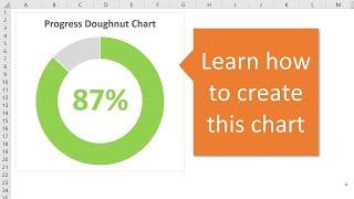
Progress Circle Chart in Excel - Part 1 of 2
Комментарии:

Is there a way I can include the data in the actual pie chart, so it works out the dates automatically without having to hide remaining days column?
Ответить
Great help. Thank!
Ответить
Clarity 💯
Ответить
Can you do this with a pivot table as source?
Ответить
Helpful
Ответить
Thank you Jon with such wonderful explanations and resources. So much appreciated. God bless
Ответить
Great and Simple... thanks
Ответить
This was so easy to follow, thank you so much! I want to visualize my savings progress to help me stay motivated. Is there a way that the actual can have multiple entries? Like for different times that I put more money aside, it can calculate the total? Thanks again.
Ответить
This was awesome and made simple. How would you do this with Count vs Percentages?
Ответить
Thank you for this concise and easy to follow video!
Ответить
Very helpful. Thank you
Ответить
This is very helpful. I’m looking for a simple way to show the team how close to our budget goals we are each day and what they would need to accomplish to meet them. If we have a bad day for example, how much do we need to accomplish the next day in order to make up for it. I find lots of charts that show year over year, but not as many that compare goal to actual. If you have others that fit into that category, feel free to point me to them ;-) and thank you!
Ответить
Dear Excel Campus - Jon, is there any way i.e. that I do not have to calculate the remainder value, somehow I fetch it into the field of the Doughnut chart? In other words, I want to create a doughnut chart with a single cell reference i.e. 35%, and the other value is always understood to be 100%. Please reply. Thanks.
Ответить
thank you
Ответить
This was fairly easy. Thank you
Ответить
Love it. Thanks
Ответить
Intelligent and simple explanation .... Bravo!
Ответить
Fantastic. "Wow"
Ответить
Great video. Very helpful for me. Thank you.
Ответить
This was epic. Thanks.
Ответить
Thank you for sharing this, it's awesome. Would I be able to do a similar thing with values not calculated in percentage? Or a different target vs actual value. Lets say our target is 4.8, or on other cases 40%. Please guide me to a video that explains how to achieve it.
Ответить
great job
Ответить
great video. thanks
Ответить
great video
Ответить
Thank you this was really helpful!
Ответить
Thanks!
Ответить
Great video!! Appreciate this!
Ответить
Thanks for the doughnut fun!
Ответить
adding the text box to show the percentage does not work if the values are coming from a pivot table. Any ideas how to fix it?
Ответить
Thanks! Great video that teaches all you need to know to make a good doughnut progress chart in just a few moments
Ответить
Helped me to do exactly what I wanted, thank you so much
Ответить
Thank you so much , I have question what if I have barrel as you know not measured by 100% but something like 210 liters how can I visualize it ?
Thanks in advance

THANKS.. NICE VIDEO
Ответить
Awesome video Jon, thanks!!
Ответить
The conditional formatting information is pretty cool, thanks!
Ответить
This is great. But for one of the chart I put together, it shows chart fully colored (like 100 %) even when its 95 %. For example X chart is 95 %, this value comes from other two doughnut charts Y and Z where Y is 100 % and Z is 90 %. I did Y%+Z%/2 which shows 95 % ideally for 5 % there should be a gap on doughnut chart, but in this case its not.
Ответить
Thank you for a clear demonstration. Exactly what I needed for my Report.
Ответить
Great lesson, I'm loving my new dashboard I built from this lesson.
Ответить
Wow! This was by far one of the easiest presentation and instructions I have ever seen. Thank you!
Ответить
thanks...
Ответить
How do you get a donut chart to depict if results are positive or negative?
Ответить
many thanks
Ответить
thanks for this great video. very simple to follow :)
Ответить
Amazing video and excellent lesson .. Thanks a lot Jon ❤
Ответить
Great tutorial, thank you
Ответить
Thanks fo this video! I have a question how can we show progress over 100% for example 120% It shows like 80% in this charts. Thanks a lot in advance
Ответить
Easy to follow, thanks
Ответить
Nice
Ответить
Hello, thanks for the video. Do you have instructions to go with Google Drive Sheets? The Donut Chart works but I cant put the text box in the middle with the Percentage showing :(
Ответить
That helped so much! THANKS!
Ответить


![BBC Presents: The MAGA Morons Of America [Concept Trailer] [Satire] [Want More?] Mockumentary BBC Presents: The MAGA Morons Of America [Concept Trailer] [Satire] [Want More?] Mockumentary](https://invideo.cc/img/upload/TTFOZ3p2YlRxakU.jpg)


