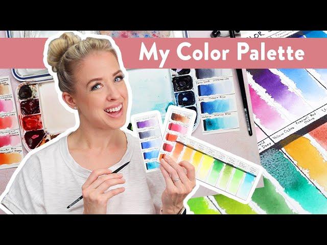
What's on my Palette? - Tips for Choosing the Perfect Watercolor Paint Colors
Комментарии:

Is Holbein Gamboge Nova similar to Winsor Newton Professional Cadmium yellow??? I'd like to have tubes for my pallet but Cadmium yellow is very expensive!!! Love this video... I've watched a few times now... I also like pretty transparent colors, except for my favorite Winsor Red, PR254!!! (Also same as Da Vinci Red!) Thank you from a California Gramma ❤
Ответить
Yay for mentioning Ali! I've been part of her Aligators group for, coming up to 3 years I think and we're a tight-knit bunch who LOVE LOVE LOVE any of Ali's colour recommendations (and special mixes) as they work so damn well with our subjects (faces!). I'm actually about to see if Dr Otto Kano has got a video on yellow ochres because she's always so comprehensive in her testing. I'm also looking for a more transparent version of that colour. I have three already but they're just not "right"! A colour that I can't do without on my palette is Perylene maroon. I have both Holbein and W&N and they're both incredible for mixing beautifully warm skin tones. I think your palette is fabulous for the range it can get you. I'm loving the look of the DS Transp Brown Oxide. That's going straight onto my "Wish List". Great vid, with thanks from Australia 😊
Ответить
So nice to see you work ;-)
Ответить
Dumb question but do those UV sprays help with the lightfastness of some paints and maybe using UV-protecting glass when framing? I'm sure these things aren't perfect, but do they protect enough to be worth investing into?
I don't use too many fugitive colors, but I don't expose my pieces to a lot of light that light effect the pieces either. I figure it's good to know though for commissions that want something specific.

😊
Ответить
Thank you. How do you decide if a color is cool or warm? Isn't it relative?
Ответить
Thank you. I think pink is unmixable from primaires. What do you do if you need a true pink, réal pink pink?
Ответить
Thank you for your great content :) So true I mostly paint botanicals and the colors I need differ a lot from what is recommended in most cases. I need a selections of pinks, oranges (WNs transparent orange is also my favorite), violets and blues that are impossible to mix in the bright quality that I need them. A little remark on the Hansa yellow light (PY3), on Kimberly cricks website she says it is not lightfast despite being rates as such. In general yellows seem to be susceptible to uv radiation and there are only a few that can be trusted (e.g., PY129, PY150, PY153).
Also I noticed that it is important to have certain colors not on my palette because when I see them I tend to use them despite knowing better. Very bright and unnatural greens fall within this category, like pg7 and pg18 that would be nice for mixes but might ruin my paintings, or strong browns or greys.

Curious why you chose Scarlett lake as a warm red, rather than a traditional cad red? Thank you!
Ответить
I have a question about how you decide on which brand to use. I noticed, for example, that you prefer permanent alizarin crimson from Holbein, rather than DS. Also wondering what your thoughts are on purchasing W&N artist paint vs their Cotman line. Thanks for all your content!!
Ответить
So helpful, thanks 😊
Ответить
New subscriber Emily! (You can thank Steve Mitchell 😂😂). Seriously, so glad I’m here. Looking forward to learning!! This video was a great start 👍😉
Ответить
Ciao,mi piacciono i tuoi video.che ne pensi dei sennelier ,rosa gallery e Daler Rowney?personalmente li trovo spettacolari,specie sennelier.ciao
Ответить
I love seeing other artists palettes and their favorite colors! Thanks for sharing! Some of the colors I can't live without are Winsor Red Deep (the perfect red!), Perylene Green or Shadow Green, Jaune Brilliant #1, and Indian Red.
Ответить
Great video. Some sad news is that Marine Blue is no longer a single pigment paint colour. Cheers!
Ответить
Been painting with you for about six months with this palette! Love your course! Can you tell me when you would choose quin rose versus perm aliz crimson? Thanks!!
Ответить
Sennelier is my favorite brand because of the large number of transparent colors. I don't have a real pallet like yours because I am all over the color wheel with my florals.
Ответить
Hullo Emily, I am enjoying your videos and seeing this color choice video is quite insightful! I will try to find any videos you have made from DaVinci paints, Have you tried any of Denise Soden's palettes? I would love to see what you make from her newest Embracing Opaque watercolors palette, Have you tried it? Perhaps you have the colors she chose in your collection? I would like to see what you think of her choices and what you might create with them! Thank you and Please have a Lovely Day!
Ответить
I have several professional brands that I enjoy but my go to are Qor and Daniel Smith. I love the quinacridones because they move so well on the paper. I use a lot of the same colors you do, and I also use a lot of different shimmery pigments made by various people in small batches.
Ответить
A super useful video. I also love to mix-up my primaries to get just the color that I want. I love the Daniel Smith primary set with the cool and warm colors.❤ Thank you so much for this video.
Ответить


