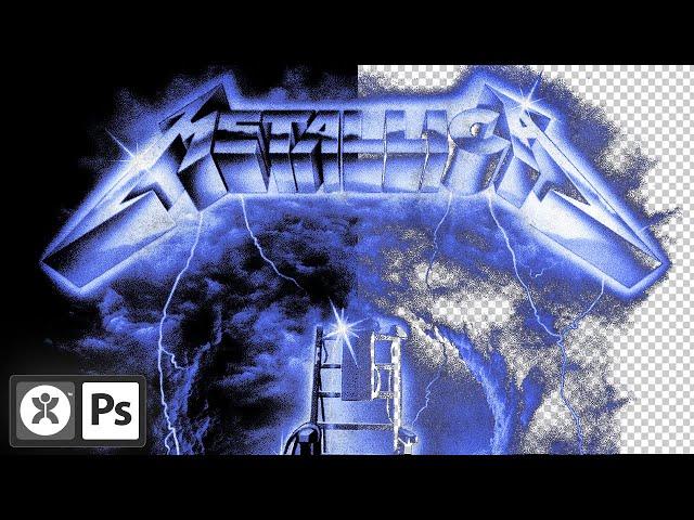
The Ultimate Guide To Removing The Background From Your Design | Photoshop Tutorial
Комментарии:

love it before seeing it
Ответить
A god walks among us and he gives great photoshop advice.
Ответить
Been excited for this one
Ответить
What program do you use to screen record?
Ответить
Waited for this video since I discovered your channel 3 hours ago ✌
Ответить
This came in perfect timing 🙏🙏
Ответить
Happy Screens Year ! 👿Do you know what Max White and Max Black options in photoshop what can help in separation process ? Thanks
Ответить
Doron, thanks for the video. I really get a lot of value from your tutorials and you have inspired me to get much deeper into the streetwear niche. I design primarily for POD but I really like the aesthetic of the early silk-screened tees. I have even done simulated process halftone separations and then re-combined them for POD, simply because I like the style. Avoiding transparency is one of the things I had to really research lately. I found 2 anomalies in Photoshop that create transparent pixels and most people don't even realize it's happening. One is the blend-if method of background removal you described here. It's fine if you do not split the sliders. But as soon as you split the sliders, photoshop uses semi-transparent pixels to actually create the smoothing. You wouldn't know unless you pixel peep at the individual pixels. The second way Photoshop adds transparency to pixels is if you scale any image with a transparent background using interpolation. If you scale an image up or down, even 1%, using any interpolation method other than "nearest neighbor", photoshop adds transparency to some of the pixels. Again, it is unnoticeable unless you pixel peep. The transparency in these two cases is so minimal that it may not even affect the print, but I still want to avoid it if possible.
Ответить
hey doron this isn't about the video but a general question, whenever i zoom into my design the color changes. do you know how to work around this?
Ответить
This is so huge! Thanks Doron!
Ответить
I wonder what the pros and cons of DTF vs screen printing are for this kind of design.
Ответить
Blend-if for the win. I use it almost exclusively for DTG file prep. 👌🏼
Ответить
Any advise on how to remove a colour background? Ie if you're working with a blue background and you need to get rid of that specific colour?
Ответить
How can i prepare these kind of designs for DTF printing ? I really appreciate your videos thanks for everything <3
Ответить
🔥🔥🔥
Ответить
Great video as always..... After using blend if just convert the layer to a smart object....it will maintain transparency, you can proceed to duplicate and rasterize the layer 🙂
Ответить
yay
Ответить
Thank you for your videos, Doron. Are you a self-taught graphic designer?
Ответить
Question - In order to capture the small details (ex. smoke, haze, gradients) would it be beneficial to bitmap afterwards? Specifically speaking for DTG print. Appreciate your work!🙏
Ответить
Thank you this is so helpful !!!
Ответить
🔥
Ответить
thanks a lot friend, precious info
Ответить
Why no do the design in png background
Ответить
I watched your video on how to do the glow/aura type design and was wondering how to remove the background, then scrolled to the comments and found this video. You're great. Thank you so much!
Ответить
you know the reason you're not making it is one. Just subscribe to doron and see the magic happen
Ответить
asking approach for dtf prints
Ответить
tha VAGUE Design is so heavenly 🔥
Ответить
the literal exact thing i was stuggling with today stressing out for no reason and then this vid pops up in my reccomended
Ответить
Two things I should have mentioned:
1. Color range and blend-if are pretty interchangeable, I mostly use blend-if because it’s easier and I typically work on black or white bg’s. Color range may come in handy if your background isn’t black or white. It also grants you a little more control over what colors you want to exempt from your selection (i.e. if the selection is catching part of your design, you can use the negative ink dropper icon in the color range panel to exempt that color from the selection). Those are rare cases in my experience so I just stick to blend-if.
2. Notice all the designs displayed are just one layer. I always duplicate&merge everything when I’m done with a design (cmd+alt+shift+e) to get it flattened onto a layer. Just easier to work with that way.


