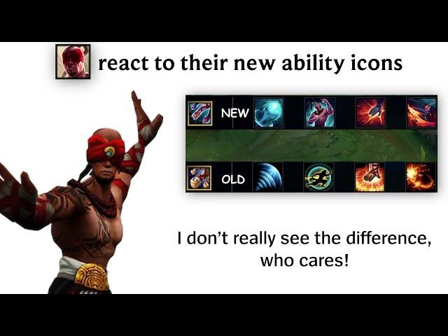
Champions react to the new Ability Icons
Комментарии:

You skipped jarvan and olaf
Ответить
I think the new zed icons are worse man. The old one was goated
Ответить
Zed's icons are literally wild rift's icons
Ответить
Is Vayne tumbling backwards or what's that?😂 the R icon looks cool tho
Ответить
fr, they ruined Zed's icons
Ответить
Yeaa I love my champions getting updates : ) though I think vaynes tumble needs to be rotated slightly and I'm pretty sure her ult and passive are supposed to be swapped (call me crazy)
Ответить
I swear, riot wants to make the entire game look like shit
Ответить
“i dont really see the difference” 😭
Ответить
AS a zed main, i gotta say im very dissapointed and that i want the old ones back
Ответить
Ohh I get it, they hate colour purple
Ответить
Vayne's q looks like she's falling into a black hole.
Ответить
Lee 😢
Ответить
ZED new icons sucks ngl
Ответить
Lee Sin probably canonically can hear the pixels and the LED vibrations
Ответить
better than vayne running like a dog
Ответить
Ori gets many buffs in a row
Same Ori, I thought they forgot me
HUH

Veigar:
"where are my icons? did they overlook me again?

Vayne's right tho
Ответить
new zeds are ugly af
Ответить
I feel like the old ones are having some originality and are unique while the new ones are just another generic riot graphics.
Ответить
Vayne's R and passive icons have been swapped, nice Riot
Ответить
essa ja é a 4 piada em sequencia envolvendo o lee sin não "ver" a diferença
continue

what is this pose on Zed R xd
Ответить
I dont play leesin, but i generally know what his abilities do. That being said while his new ability icons LOOK cool, the old ones look like they make more sense. Like at first glance its easier to associate the icon to the ability
Ответить
Why would they do this?
Ответить
new icons suck
Ответить
oh great another update for make happy credits or else they get executed
Ответить
ZED got a Jhin treatment with the colors ( dark cosmic jhin and the new chroma)
Ответить
Honestly most of these are bad, just look at Zed W or E and Orianna Q, with the old ones you can understand the abilites by the icon, with the new ones yes they are more realistic or would be a better picture but dont so the job of an icon well, which is to be as simple to understand as possible. Some of the old icons have this problem but a lot of the new ones for sure.
Edit: Also Zed's color palette might be CORRECTED, but that doesn't make it better since there's no contrast and you really cannot distinguish things in the icon, especially W which looks like a rock on a mountain or just a cliff or smt...

Zed's only problem is the W and the E lookinh weird and not at all representing the ability, the color is fine since he was never blue.
The rest are awesome !

Why are all of these worse
Its hard to tell what some do compared to the originals
Also, who the fuck thought that zed's abilities would be better if they follow the color pallete of zed, DID YOU ACTUALLY THINK THAT DEATH MARK SHOULD BE CHANGD so hideous.

- Lee Sin: New passive looks better, Old W and E looks better and both their ulti still sucks, just add his foot with flame or something and that will be good enough
- Zed: Colour palette is corrected 💢💢💢 matching with his skin/texture but I think old Passive and W drawings are better and suits him more, Q and E is definitely improvement. About ulti, I am conflicted. Both looks good but I guess old drawing is more Zed like while new is for different champions like Fiddlesticks
- Orianna: As ballerina her new passive suitable and E is best. Ulti is overall improvement. Both Qs are acceptable but her new W is better. I guess she really needed that update.
- Vayne: .... I dont understand why would her new passive would be better? Q is actually a recession beacuse you cant be 100% sure if she is doing a backflip or frontflip, in which old one we can see she is rushing forward. New W is better. E is actually worse because old one keeps reminding you or new players a good trick. Her Ulti is just... mixed feelings, personally I think old one is better while new ulti is looks like anime character or would say something like "I am Vengence, I am Justice, I am Vayne" with anime character voice lol

New zed Icons are trash
Ответить
They somehow made some icons uglier and less obvious
Typical riot L

They fr changed Lee Sin's icons before his model. Bro he looks anorexic. It's like Xin Zhao having a very noticable crease in his hair. Or Veigar looking like a RuneScape enemy. Or Zilean just looking, uncanny.
Ответить
What the hell are these
I hope they don't apply these to wild rift

MY LEG!
Ответить
i liked the old oriana icons they were simple and clear. the new ones are maybe a bit too complicated except the e which is beautiful.
Ответить
So vayne switch her passive to her ult? And q is a backward roll?
And why is her e look like it came from lucian's kit?

VAYNE E IS LIKE TWITCH R
Ответить
Omg the new Zed abilities looks so bad tbh
Ответить
Lee sin is a pretty cool upgrade
Zed now matches his color scheme better, although the old W icon was pretty badass. I'll miss it.
Orianna's icons are more self explanatory, but with the icons being small I'm afraid the details might look blurry.
Only thing I dislike about Vayne's icons is the R. It looks kinda ugly in my opinion. Also the Q would look cooler if they flipped it vertically

damn, I'm ready to fail loldle quiz harder
Ответить
NO DONT DO IT ITS SO UGLY
Ответить
Zed icons look cool tbh
Ответить
vayne is indeed in falling motion look at her hair
Ответить
Lee Sin surely won't notice the icon are different 🥸
Ответить


