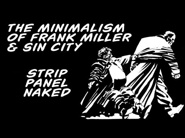
The Minimalism of Frank Miller & Sin City | Strip Panel Naked
Комментарии:

Based Franky.
Ответить
Great work dude
Ответить
I'd love to see a contrasting video on an artist like Darrow.
Ответить
Miller's always a joy to read, back in his prime.
Ответить
Sin City is wicked!
Ответить
the product definitely has all the qualities that you speak of. but I don't know if frank miller deserves all the credit for that. or if he is fully conscious of the elements that manifest them.
Ответить
That bleedy wet looking transition works rly nicely!!
Ответить
his art was the best in sin city
Ответить
I wonder if any part of Miller's visual storytelling style here is influenced by Broadway, or just theater, in general. I see it in that opening page background -- the silhouettes of the chimneys and an industrial area's various structures. It's suggestive and evocative, but it's not "real" or a simple photograph of a specific place. It's a mash-up of elements. I've seen that kind of thing projected or painted on the back walls of theater productions to suggest a setting for the characters in the foreground. You never question it as the theater-goer. It evokes the environment and that's all you need.
Ответить
Excellent!
Ответить
You need wayyyyy more views for all the work you're doing with these videos. They're incredible! Just gained a new fan
Ответить
Thankyou for this. As an artist I have come to appreciate Miller more and more as I mature as a creator. Everything is deliberate and to evoke emotion. Very well done video.
Ответить
Grade A 🙏
Ответить
came for passion and clarity, wasnt dissapointed. love the passion in your voice, keep itup!
Ответить
id like to see this revisited and more in depth theres so much in sin city that is pure genius (that word used to mean something)
Ответить
I’m looking for an artist who can draw my comic like this
Ответить
This is not minimalism. Do your research.
Ответить
brilliantly made video thank u for the education - i love the power and effectiveness of the minimalism of frank millers art - i actually find the simpler it gets, the better it gets - and you explained all of its value so well.
Ответить
So cool i love that book so inspiring
Ответить
In my opinion, Frank Miller as an artist got lazy after Sin City. His “minimalist” style may work for his noir comics, but just look at something like “The Dark Knight Strikes Again”… pure trash
Ответить
Nice video. It was very helpfull. I have been an aspiring writer for some years now and this year i have began drawing again, because i have some story ideas, that will work better as comics. I have always loved that minimalistic style i have seen from the Hellboy comics and wanted to do something similar, but in black and white. Now i have to check Sin City out and try to copy it in my own way and analyse how he use the contrast between black and white on the pages.
Yes. I have never read Sin City. o_O

Sin city is my favourite art in any comic ever. Got the 1st in the special slipcase edition absolutely beautiful!! Picked up the next two in paperback.
Ответить






![Stray Kids [INTRO "Lose My Breath (Feat. Charlie Puth)"] Stray Kids [INTRO "Lose My Breath (Feat. Charlie Puth)"]](https://invideo.cc/img/upload/a3hjZVc1YTB6ZHU.jpg)

