Комментарии:

Legitimately pretty good except how AI couldn’t decipher what “Say cheese” means lol
Ответить
Some are very Beksiński-esque
Ответить
We don't need humans anymore
Ответить
The dummies looked more like crash test dummies.
Ответить
Took say cheese and die a little too literal lol
Ответить
Brilliant!!!
Ответить
I like how "The ghost next door" the AI just puts ghosts next to doors lol
Ответить
Hey, prooft gmthsy AI isn't gonna take over right here.
Ответить
it will always be less disturbing than the French covers 😅😥
Ответить
Music serving real housewives realness!
Ответить
This shows we’re still superior, for now
Ответить
Damn all these covers look like legit horror covers for adults… except Say Cheese and Die 😂 buddy took that title way too seriously 🧀 🎲
Ответить
Goosebumps are those books which you'd keep as a Treasure, coz you know these cover designs once gone, won't come back and so the nostalgia. My friend gifted me some books and I've still treasured it. The Werewolf cover was THE BEST!
Ответить
Ahhhh that soundtrack 👌
Ответить
Terrifying
Ответить
What's the background called?
Ответить
Ai generated stfu
Ответить
All of these would make epic album covers
Ответить
Stay out of the basement became a whole different plot. Say cheese became some kind of food parody
Ответить
Lol how ghost next door generated a ghost, next to a door, not connected to or leading anywhere.
Ответить
I'm loving the "deadly" cheese
Ответить
That's the end of Goosebumps bye guy
Ответить
Why do all the Welcome to Camp Nightmare covers remind me of the Quidditch World Cup campsite from Harry Potter?
Ответить
Ahhh Goosebumps. Where the main characters always have parents/family who are super neglectful and have the IQ of a slug.
Ответить
😍🤗 que recuerdos más buenos fe verdad me traer una nostalgia muy buena esta serie
Ответить
The "Say Cheese and DIE" variations are probably the goofiest, and imply a COMPLETELY different story than the actual one. The "Girl Who Cried Monster" cover invoke a far more real and disturbing type of horror, however.......
Ответить
I be mesmerized
Ответить
I really like the first cover for Let’s get Invisible
Ответить
😂😂😂😂😂 theses are trash
Ответить
Badass
Ответить
The very last mask is off the fkn chain
Ответить
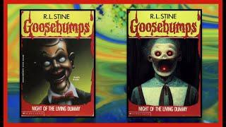
What's with the extreme consistency with Night of the Living Dummy?
Ответить
I got the idea to use ai art generator with goosebumps books today and came across this while looking though book covers. Look like you beat me to it! Nice work!
Ответить
Nothing beats the originals
Ответить
Why is nobody talking about the haunted mask?
Ответить
They look like a color interpretation of the "Scary Stories" art style, and are legit creepy and awesome. I also like how the AI is still learning and makes mistakes, it actually adds to it with weird unnatural, surreal features here and there.
Ответить
Goosebumps horror films for kids
Ответить
ai slappy is not even a vintriloquist dummy like bro
Ответить
"I will know if i made in life if i can just pause snd sketch goodebumps covers!
THAT IS MY GOAL

the AI ones look like ass. long live humanity
Ответить
Aint no way the Haunted Mask from the upcoming Disney plus series takes inspiration from the AI depictions! Straight up a white mask like in the trailers. Uh oh.
Ответить
Pretty much all of em are worse
Ответить
Cheese one was hilarious
Ответить
Say cheese and die is literally what was asked and got 💀
Ответить
The AI version looks more like "Scary Stories" 😅
-

Is AI stupid?
Ответить
Some of these are scarier, and some aren't. It's interesting to see.
However, the Say Cheese ones really don't fit. XD

Welcome to dead house by ai looks really awesome Some of the book covers by AI looks awesome, some of them just looks like it takes itself to literally. some of them Not the best Especially the girl who cried monster
Ответить
I posted the AI images in my community tab if anyone wants to checkout the images unedited.
Ответить
