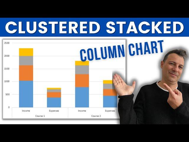
How to create a Clustered Stacked Column Chart in Excel
Комментарии:

Thank you sir, i am trying to make a single bar, how to make.. tried but unable..pls help
Ответить
Good video. How do you change the height of each cell (the diff colors) to show the data values inside them?
Ответить
Brilliant, I didn't realise it was that easy, thanks so much!!
Ответить
Thank you! It saved me a lot of time!
Ответить
Thank you !!
Ответить
thank you! I got exactly what I was looking for!
Ответить
This helped, I got the graph I was looking for! Thanks!
Ответить
How can you add additional data after it is already created?
Ответить
This video looks very helpful for me.
Thank you so much.

Awesome, Very useful!!! Great!
Ответить
Exactly what I needed
Ответить
that sweet Greek accent <3 :D
Ответить
Thank you; I used this concept for work. I was pulling my hair out trying to figure the solution. Thanks again.
Ответить
This is a "Stacked" column chart. This is not a "Clustered Stacked" column chart. "Clustered" column charts are where columns are grouped along x axis (think 3 groups of 2 bars close to each other for a total of 6 bars).
Ответить
Thank you!
Ответить
logo
Ответить
when i do this on my computer im having an issue, can someone help me? my titles are are going where "income" and "expenses" is on the chart.
Ответить
how do you get the columns within one course to have different color palettes? For example: if you wanted income to use blue hues but expense to use grey hues?
Ответить
Hello could I ask for your email ID. I need additional help,
Ответить
Thanks :). It was very useful the: "switch row/column" ;)
Ответить
Great help
Ответить
Hello,
your video has helped me so much.
Thank you :)

i have a question. i'm trying to make a clustered stacked graph. where i have the mass of Soil, Roots,Plants and leaves. i can combine them in a stacked column. But i would like to visualize that the roots and the soil are underground. so iwant them UNDER the X-axis.
I have tried with giving them negative values. and that gives me a visual representation of what i want. but it is not very elegant. to have these negatives values for the mass of my samples.
Any ideas of how i could have an elegant solution? :)
thank you for your time

Try MarketXLS
Ответить
How do I sort the data if it involves percentages>? So smallest percent is on the bottom of the graph?
Ответить
Thanks gia thn voitheia aderfe!
Ответить


![TAYLOR SWIFT 1989 ERA MASHUP (Taylor's Version) [22+3 SONGS] MEGAMIX by AnDy Wu TAYLOR SWIFT 1989 ERA MASHUP (Taylor's Version) [22+3 SONGS] MEGAMIX by AnDy Wu](https://invideo.cc/img/upload/Y0VycUpmN2JWM2o.jpg)


