Комментарии:

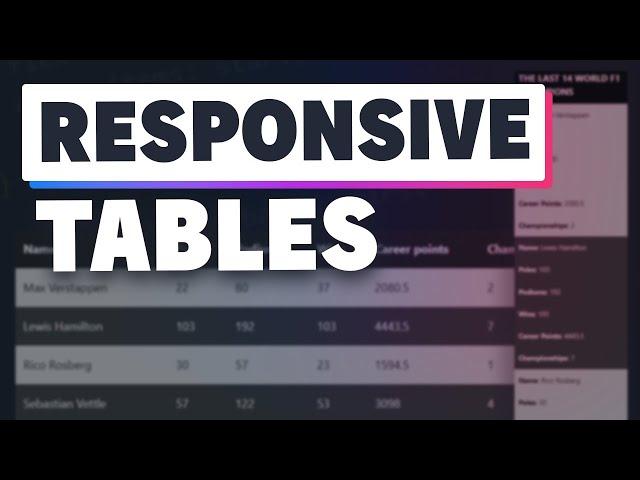
what i like to do on small sizes is to split (visually) the table rows, so they transform from table rows to self contained blocks/entities from a UI perspective
Ответить
I was thinking you were going to do a sticky header and a sticky first column.. that way you could scroll the content inside without losing context of the headers and first column…
Ответить
as always its fantastic!! :)
Ответить
You get a like just for using a F1 Table 👍🏼
Ответить
Thanks for this video! Very helpful 💪
By the way, i've made a new JS Code for Table Aria Labels. Check it if you want!
function AddTablesAriaLabels() {
const tablesAriaLabels = document.querySelectorAll('table');
const captionsAriaLabels = document.querySelectorAll('caption');
const rowGroups = document.querySelectorAll('thead, tbody, tfoot');
const columns = document.querySelectorAll('th');
const rows = document.querySelectorAll('tr');
const cells = document.querySelectorAll('td');
if (tablesAriaLabels) {
tablesAriaLabels.forEach(tableAriaLabel => {
tableAriaLabel.setAttribute('scope','table');
});
}
if (captionsAriaLabels) {
captionsAriaLabels.forEach(captionAriaLabel => {
captionAriaLabel.setAttribute('scope','caption');
});
}
if (rowGroups) {
rowGroups.forEach(rowGroup => {
rowGroup.setAttribute('scope','rowgroup');
});
}
if (columns) {
columns.forEach(column => {
column.setAttribute('scope','col');
});
}
if (rows) {
rows.forEach(row => {
row.setAttribute('scope','row');
row.children[0].setAttribute('role','rowheader');
});
}
if (cells) {
cells.forEach(cell => {
cell.setAttribute('scope','cell');
});
}
}

Thank you, Kevin! This is a great solution!
Ответить
Thank you for this valuable video! Kevin, it is the best solution for my project!
Ответить
Many thanks
Ответить
this video is awesome (liked and subscribed :)
..but would you mind explaining, how to turn this into a mobile first design?

TY!!!
Ответить
Loved Ayrton Senna inclusion 🤩😭
Ответить
Kevin what if we used grids for table layout? I think we could have much better control of everything. Position sticky will work + resize columns option.
Ответить
Great video! Thanks!
Ответить
Collapsing tables should be standard for every CMS since like decade ago...
Ответить
I've been struggling with CSS and every video you made has clarified every issue i have with. Now i can make decent web sites that doesn't look as they were made for Netscape
Ответить
This really helped me beef up my final, thank you!!
Ответить
I also like to use the thead, tbody and tfoot. Gives a bit more flexibility for styling.
Ответить
Now, try to add vertical scroll into the body only, so header stays always visible. Would be nice to see how this could be achieved ;)
Ответить
I wish I had this technique for pass project
Ответить
Terrific ideas beyond the container overflow-x trick, which is what I have usually gone to. Thanks!
Ответить
well, side scrolling on mobile works from any position... just sayin
Ответить
There is ZERO reason to be using tables in 2023. None whatsoever. Period. Tables are just plain awful and cause all sorts of problems. With grid and flex, they are 100% obsolete. If you're still using tables, you suck at your job.
Ответить
Life saver
Ответить
Thanks a lot!
Ответить
This helps alot , Thanks @kevin
Ответить
Kevin the man, the myth, the legend!
Ответить
gracias.
Ответить
매우 친근한 아저씨😊
Ответить
Kevin, this is Awesome. I'm so glad I found your channel! Loving pretty much every video you put out!
Ответить
This is awesome. Shopify unfortunately does not seem to support the "content" element. Does anyone know of a workaround? I'm not looking forwarding to adding headings to every single td and then hiding them for desktop view.
Ответить
impressive 🤔💪
Ответить
wow... very practical tips
Ответить
I'm missing tbody and thead :)
Ответить
TY TY TY
Ответить
Hello! What if the columns and rows are inverted? I can't find any solution to display one column underneath one another instead rows like u did in your example.
Ответить
What a brilliant tutorial. Hits the mark perfectly and easy to follow. Thank you.
Ответить
Already 3 championship titles for Max :) so you need to update your video :)
Ответить
Table without thead and tbody... O boy.
Ответить
This video is exactly what I was looking for. Thank you!!
Ответить
You taught me CSS and now I'm one of the best in the whole University..
Thank you Kevin

I think we can re do it with the subgrid property.
Ответить
This is a type of channel where you come thinking you know it all and by the time the video ends, you're 100 times wiser than before. Thank you very much Kevin!
Ответить
You forgot the thead and tbody
Ответить
it came in with a tbody but it did not keep your th elements, it changed them, it needed to bring in the thead and role = thead love this video. You have so many I have not seen but I am going to use this today. I have a table of data I was trying to figure out how to make it like this and this did it for me thanks :) maybe you didn't add thead and tbody because it might have changed out the information. Maybe I can find an alternative to data-cell or nthchilde() to add the th in front of the td when I make it responsive to mobile. But I liked both approaches but the nthchild I like more because you can change the name in one of them and don't need data-cell in every td element. Tables on a website don't usually have more then 5 columns anyways, well the ones I used ;)
Ответить
what beautiful work. thank you!
Ответить


![Shoe Product Animation Blender Tutorial [Trailer] Shoe Product Animation Blender Tutorial [Trailer]](https://invideo.cc/img/upload/WVhEeG00MUlhNnA.jpg)


