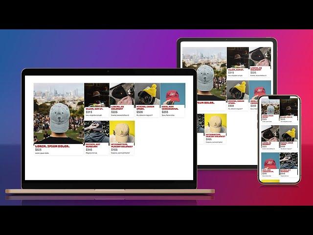
Learn how to create a responsive CSS grid layout
Комментарии:

No doubt about it, every time i have struggled with css, this is the place to come. thanks a lot.
Ответить
And this is what you called in the first sentence of the video: "So easy" ?
My thought after finish watching is: "Very reliable" 🙄

Merry Christmas, Kevin
Ответить
Thank you! Now I know grid-template-columns: repeat(auto-fit, minmax(x,y)) and aspect ratio better.
Ответить
😮Just discovered o haven't subscribed after week of watch your tuitorials, Kelvin you're a saviour to we beginners
Ответить
Nice tutorial worked perfectly for creating a home page of apps
Ответить
Thanks for make this awesome video🔥🔥
Ответить
you good and i like your videos but you talk too much out of subject which is very annoying.
Ответить
I am doing my homework and was stuck with the grid layout for the whole day, and then, I found your video! definitely saved me! thank you so much for this fantastic video.
Ответить
Thanks for the grid lesson Kevin. Help me so much 🙏🏼
Ответить
thx
Ответить
i like ur shirt 🤣
Ответить
I'm a bit late with this but thanks Kevin I've just finished a big real world project for a client and this video nailed it for me!
Ответить
Thank you so much Sir for this tutorial, it saved my life.❤❤❤❤❤
Ответить
Hands down for this legend 🙏🏻💯🙌
Ответить
Very helpful guide! Thank you
Ответить
That shirt's hilarious
Ответить
Does repeat(auto-fit,minmax(15rem, 1fr)); removes necessity for @media (min-width:...) ?
Ответить
I'm a big fan of your tutorials and I like the way you handle css, but I get a little frustrated about semantic.
For instance, when you create a card, shouldn't you be using figure, img and figcaption ?
I think it'd be more efficient as far as accessibility is concerned, am I wrong ?

Grid area's is my thing now
Ответить
hello kevin im a beginner in this field when i saw the predefined ccs rules im really confused because there are alot of things i dont know and didnt use
Ответить
why would you put container in rem values?
Ответить
Another great one
Ответить
This is soooooo AWESOME 🤩🤩🤩🤩🤩
Ответить
I've watched so many of your videos now and with each new video I watch I keep thinking of how much I learn from you. Kevin, you're amazing. Please keep doing what you're doing.
Ответить
Thank you!
Ответить
Kevin, I cannot thank you enough for all this wonderful knowledge that you’ve shared. You have helped me become such a better programmer. Thank you!!!
Ответить
i don't think you need aspect ratio here
you can just use height: calc(100% - 1em) or something like that

Cant describe what you have openned my eyes, Kevin!!! Thank you so so so much!!!
Ответить
Thnks a lot for this, ur the best!
Ответить
Amazing Teacher!!!
Ответить
Grid isn't supported in ie10 and 11 though? How can we cater for these browsers?
Ответить
man, nowadays is so easy to develop good looking website.. back then when im actively working as web dev, i still remember that designer need to use `table` to create some sort of layout.. then come along `float` that make everything much easier.. `grid` is even easier to use..
Ответить
You're truly the best. Bingeing your channel for the past few months. Sincerely, thank you!!!
Ответить
Just great vid :) Very useful and clear
Ответить
What keyboard are you using? Thanks for teaching us CSS!
Ответить
Mind: Blown 🤯
Ответить
Kevin, thank you for the wonderful tutorial ❤️ You make me dominate my colleagues when it comes to CSS :D
Ответить
Why can't you make tutorials without showing your face? Not everyone wants your face in their face.
Ответить
Thank you Kevin, your channel is a web tool. Always learning new things from you
Ответить
this is the layout that I've wanted for my clothing store - because it's got a comic book style and that's the sort of timid approach to anarchy that I am comfortable doing. And it looks so good! But then I also managed to break something, I was putting it all together on a 2560 x 1289 monitor and I started fiddling with the grid size & aspect ratio until it stopped looking bloated, then I uploaded to check it on my ancient oneplus (6 I think) phone, looks great. smaller iPhone 12 looks even better! - but then It gets messed up on the iPad AIR at 820 width because it pulls the card content div 100% on top of the image. I am super scared of fiddling with it any more because on an iPad Pro it looks perfect at both 1024 & 1366. How far do you go for perfection? I wish I was more confident and could hold knowledge the way you do, you make it look so easy!
Ответить
Awesome!!! You ROCK!! :)
Ответить
Beautiful
Ответить
The full outline of how to really use aspect-ratio makes me really happy.
Ответить
Great demo. Thanks for creating it!
One thing I noticed is that you're using an h2 but no h1, which is a bad thing for accessibility, since it breaks the semantic hierarchy of headings.
If there's only one level of heading on your page, it should always be h1, and you can style that to be whatever size you want.
If you're assuming that there would be an h1 above the grid on a "real page", then it would be helpful to say so explicitly, so that your viewers don't accidentally pick up practices that harm accessibility.

Kevin - dude, you are simply an amazing teacher - thank you so much for all your hard work - cannot wait to see what this year brings
Ответить
Grazie.
Ответить
Great lesson, never used it like this before, really thank you Kevin.
I have one question. What if I have two grids on top of each other, and each one has its own cards within it, how to make the same width for all the cards in the two sets?


