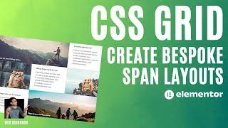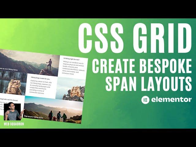
CSS Grid Bespoke Layout with Span - Elementor Wordpress Tutorial
Комментарии:

thank you, thank you, thank you!so so soooooo much!
Ответить
very nice, thank you! Does it also work with a taxonomy filter? do you have any video about that?
Ответить
super helpful, thank you
Ответить
You just saved me countless of time. Thanks ser
Ответить
Great vid again! Is it possible to populate that kind of grid with dynamic content / custom post types?
Ответить
Nice, thank you! Can I have a grid in a blogpost?
Ответить
Will this be implemented in the GRID module, instead of using custom CSS?
Ответить
Thanks for this great tutorial!
Ответить
aspect-ratio: 16/9 /* when the image feels too square in mobile */
Ответить
Another decent feature and nice video to explain it all, thanks Imran.
Ответить
Very nice video! Making sense of this now.
Somehow, my layout worked without the 'grid-row: 1/3;' of the code!
Thanks Imran!

Nice! Thanks for creating this tutorial!
Ответить
Another awesome walkthrough mate. It saves me a lot of time figuring things out with this. Thank you!
Ответить
Thanks Imran, however, I had to set the min-width to 768px for the CTAs to maintain the two-column span on the tablet as they do on the desktop:
@media screen and (min-width: 768px)

cool video, isnt a method to autogrid or autoshrink the grid on other device if a cannot display 3 columns then use one. bricks do it more easier in that way... anyway im using elementor again cause bricks it is not working well with compatibilities..
Ответить
I believe they'll be adding span controls soon. One nit: you said "when the resolution is greater than 780px". I think you meant when the screen width is greater than 780px. Responsiveness has nothing to do with resolution, something many people watching videos like this get confused about. (also, why 780 instead of 768?)
Ответить
Very informative video imran 👍 thanks
Ответить