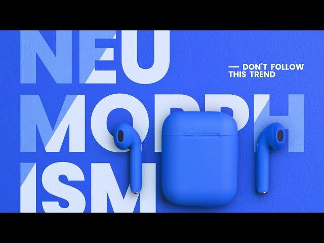
NEUMORPHISM - DON'T FOLLOW THIS TREND! | TemplateMonster
Комментарии:

FLAT DESIGN SUCKS, NEUMORPHISM AND SKEUMORPHISM IS OVER 9000 TIMES BETTER THAN FLAT DESIGN.
Ответить
Neuomorphism does not feel like a continuation of 2000s UI design. It completely throws accessibility out the window. I would hate to use this daily for actual work, no matter how ‘pretty’ it looks. This is way more soulless than flat design, which is usually very colourful especially in the early 2010s. Not having gradients doesnt mean something is “soulless” - a lot of flat design is very expressive and bold.
I wouldnt take “looking pretty” over accessibiltiy anyday, even if we went back to UI design similar to that of the 2000s (even that is better than neuomorphism). Ive used Linux for a long time now, and ive tried out more skeuomorphic and detailed UI with things like the Crystal Remix icons and themes on KDE. It looks pretty, like eye candy at first. But when you want to actually get something done, its horrible compared to the more minimal approach most operating systems have nowadays. Neuomorphism does not strike a good balance, because it literally erases the border between the buttons and the background, this doesnt make it seem cohesive or like it has depth, it just makes it look like its all the same and its hard to tell apart. Neuomorphism is soulless and looks sanitized as hell, as if its trying to be as inoffensive as possible.

Is here to stay and thanks God for leaving flat behind. Also, I can’t stand purple and violets anymore.
Ответить
Honestly, I feel like the buttons argument is quite dumb.
Avoid low contrast text at all costs, mark the button states CLEARLY, by adding a colored border, or by changing background and icon color in a very visible way (accents color realy help here). You can also just use a switch, oftentimes. These elements aren't prohibited on neumorphism, it is more about having a depth effect similar to real dashboards. This by itself, when not abused, can't in any way confuse the user.
If the problem is that ANY different UI will confuse the user, we're really making both design job and the users very very lazy. This is finally some new cool design idea, it's in my opinion sad to lose it.
The only scenario where it can work a bit bad, is on UIs that require many controls. This is a design that requires a bit more space.

I’d prefer just return to regular skeuomorphism but this is still way better than flat design
Ответить
People also thought the internet was a dying fad in 1997.
Ответить
Better than flat n ugly
Ответить
Neumorphism is just better
Ответить
Yes please follow this trend! It looks so much better than flat design. Also bring back the translucency glass and the 3d look. Just get rid of flat design already.
Ответить
The trick it’s not use it alone, mix neumorphism with material and it’s pretty cool
Ответить
I'm actually kinda happy skeuomorphism is coming back
Ответить
Flat design for a multicolor supported monitor is degradation.
Ответить
it guded lot
Ответить
better than flat
Ответить
Correct, do old style Skeuomorphism instead
Ответить
I think it is here to stay because it reflects 3D reality - that is how I see it.
Ответить
My main issue with flat design is that the flatter it is, the more soulless it is. Skeuomorphism felt like real life and while it did not have the visual flair that Flat Design has in most cases, it felt alot less, should I say, corporate.
With Neumorphism, I think it strikes that perfect balance. It feels like an independant art style, something trendy and underground. It won't ever replace Flat Design entirely in terms of usage, however I think that is for the best. The design was made by people who weren't at the top of the food chain, and it'll stay that way.
I do hope that this design philosophy does stay around though. While most uses are from indie and smaller developers, Apple and Microsoft's take on the design are both beautiful, with MacOS 11 Big Sur and Monterey and Windows 11 all looking beautiful in my honest opinion, with Windows 11 honestly being my favourite Windows design of all time for the icons imo, taking the place Aero used to occupy for me. While my favourite design will always remain MacOS Mountain Lion and Mavericks, MacOS 11 / 12 will remain a very close second, only losing out to a semi-noticable infrequency.

I'm very late to this but what do you think about using it for purely visual mediums, like motion graphics and social media graphic design?
Ответить
Web3 solves all issues, skeumorphism and Neumorpism for the win! Flat designers are like web1 ms-dos websites. 🤣
Ответить
SKEUMORPHISM IS BACK BABY!
Ответить
Oh that was a good critique of neumorphism.. When I saw it for the first time I thought "Yea! Finally something interesting will change minimalism trend, which everyone is already tired of. Even if Apple was used something similar in new MacOS design, then it should be new trend, as it was with minimalism design". But okay, now I'm a little upset
Ответить
Isn’t google material design the same concept especially with shadows?
Ответить
Oh they followed that trend
Ответить
NEUMORPHISM is amazing.
and i hope it will KILL flat ui!

I like it
Ответить
i take this over flat design
Ответить
It kinda reminds me of old Windows XP! I really like this
Ответить
I was surprised to find out that I was alone in thinking that neumorphism doesn't make sense. It doesn't serve any kind of use case or solve any existing problems. And it might look fancy on Dribbble or Behance as concept art but not so much when translated into real app. Skeuromorphism made sense cuz it serves intuition, flat design make sense because it amplifies content, but this doesn't fit in to any kind of problem (IMHO).
Ответить
I love neumorphism, I will always use it now
Ответить
Im being forced to use this by the parent company, who dont do any design themnselves. its very irritating and dificult to work with. Im having to create overly complex solutins to make screens look just 'ok' rather than excellent. this is what happens when people who dont know anything jump on a band wagon. personally i think its a very old looking style, circa 2010 not 2021!
Ответить
Apple: Bet
Ответить
Loved the video! Do you, by chance, have the source files of the thumbnail? That is one of the coolest designs I've seen, so I was just wondering. Thanks
Ответить
I tried it yesterday and I'd like to say for computer science project presentation it is the best ... Lecturers are not used to such design concept hence they gave me an A 😂😂😂 for a web page development
Ответить
You're right - does not work on large scale projects and has critical accessibility issues.
After testing it extensively, as you said, things like cards and sliders (and graphics) are where it works best.
It's a nice touch / flare to add to design and I'm excited to see the creative ways designers end up using it.
But a full app with only neumorphism - nah.

Uhm. What you are saying is only half true because you are only really adressing the absolute minimal basics of neumorphism.
Let's talk about the button thing, of course the change is minimal if that change of shadow is all that is there to indicate an activation, but did you ever think to consider that neumorphism does not excluse the use of colors? Typically buttons have icons or text on them, which can light up when the button is activated, there's a common theme for things that are ON to be blue or green, and things that are OFF to be red or grey. There's absolutely no confusion here, instead the shadow around the element just makes it clearer what can and cannot be clicked compared to flat design where it is often totally unclear and you have to be farmilliar enough with this type of technology to know it intuitively, and even then it sometimes doesn't work instantly.

the trend got famous cause it looks like apple product
Ответить
Glassmorphism is my favourite
Ответить
I prefer flat design
Ответить
Light Neumorphism came first, and seems to be what most people associate with Neumorphism still.
Obviously Light Neumorphism doesn't work, the accessibility is terrible, it's as train just to look at.
Dark Neumorphism on the other hand, deserves its own review. It can be contrasted well with vibrant colors, which stops it from being a "soft-ui" thereby repairing the accessibility problem.

This doesn't work for icons
Ответить
I like the idea. I'm going to use neumorphism in my KLWP project for a minimal UI.
Ответить
That shit's around for years. If you are that far off if it is about research, why shoudl anyone listen to anything else coming from you?
Ответить
UI designers need to calm down because for developper it's a pain in the ass to fit a model like this 😂
Ответить
Indeed☺️
Ответить
I just fall in love with this design.. not only users, designers and coders also has their word.. as the famous said once.. users dont know what they want until u tell them or show them or something like that 🙃
Ответить
Well, after Big Sur launch this isn't going anywhere
Ответить
I love skeumorphism... I don't get why it isn't more used. You got this beautiful thing here, and you got this boring thing here. Yeaaah. Think I'll go with the boring thing, cause "ain't no use for the skeu-thing anymore." Well. There is no use in having a beautiful car either, if it moves. Goddaamn hipsters.
Ответить
this style gives me healthcare/medic vibe, dont know why would this be a thing. Its just inner and outer shadows
Ответить