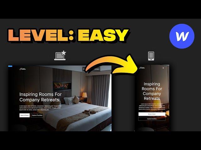
Responsive Website In Webflow (Step By Step)
Комментарии:

Not a good tutorial and not up to Flux standards
Ответить
Great tutorial for me, thanks man!
Ответить
If you did the same using only PX and VH/VW for the section sizes, the outcome would have been the same because the root element's pixel size didnt change. In that case, whats the point of using rems if you know, that the root element will stay 16px no matter what?
Ответить
Can someone help me with one issue? I have a div that has content (text) in it and when i scale it down to mobile portrait, that same div doesn't increase its height as it should and final product is one mess where text overlays that div. I don't have any specific height to any of the divs in section.
Ответить
Great tutorial thank you, but I struggled for an hour or so on my background image not being responsive after changing the vw to 100%, it finally worked after changing the background image to a cover instead of custom in BACKGROUNDS sections of the HERO SECTION.
Ответить
thanks! really useful and clear :) beginner here!
Ответить
wft
Ответить
Do u need to add those parameters to all sections in your site or u can just do it with the container?
Ответить
Dope shit.
Ответить
Doesnt work for me.
Ответить
Thank's, It's saved my life😅😅
Ответить
Really interesting video on rem
Ответить
This was an amazing explanation of responsive design in webflow! Thank you!
Ответить
Any particular reason that you use REM's vs. EM's for padding? I've always struggled with deciding on whether to use REM's for padding / margins or use EM's for padding / margins.
Ответить
Could we get assets for the website , or the figma file
Ответить
Great vid! 🍻
Ответить
456
Ответить
So when you click on the media icons at the top are you really defining (albeit in a much more user friendly way) CSS @media queries? Once the design is finished can you then export the HTML and CSS along with the media queries?
Ответить
Sir plz make webflow 2023 updtaed 2 to 3 hours long crash course
Ответить
Arnauuu
Ответить
Nice
Ответить
In the HERO SECTION is better to use 100%, using 100 vw can cause horizontal scrolling
Ответить
What about the fact, that your background image only shows a lamp on mobile and not the beds? that not really responsive
Ответить
Just perfect, I understood everything. Thank you!
Ответить


![[Free] Drake x Jack Harlow Type Beat "Pop Off" (Prod. Palaze) [Free] Drake x Jack Harlow Type Beat "Pop Off" (Prod. Palaze)](https://invideo.cc/img/upload/WS1zbV9oYXFoY1Y.jpg)


