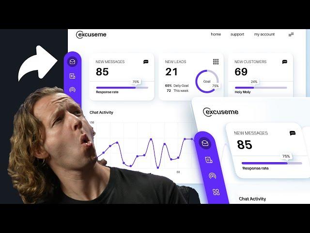
How to Design a SICK Dashboard UI in Figma
Комментарии:

Jon Frok will be coming back soon.
Ответить
what does "SICK Dashboard UI" means?
Ответить
hey!! can i recreate this dashboard design and use it in my portfolio?
Ответить
very interesting and informative.
Ответить
How cam i view its html
Ответить
Great design dude
Ответить
Very helpful, thank you!
Ответить
New to Figma this side. I downloaded the Project file and opened it in Figma. When I tried to access Assets I don't see any of them. Any idea why?
Ответить
Thank you sir
Ответить
Thank you for your good teaching. Why didn't you use the layout grid? With this design feature, it becomes easier and better!
Ответить
Loved it, super enjoyed it! And I did not know anything about designing with Figma. I will let you know how it goes :)
Ответить
Why don't you use components, auto layout and hotkeys? It looks pretty but it can be built much faster and more efficiently...
Ответить
Yes, it’s “sick”… it will make a lot of views on dribbble.
But in real life this design is complete waste of time and money.

LOL Sick! - -
feel better

...Froking liberals. Competent, but I wont listen to him.
Ответить
I don't understand why build a card that way?
Ответить
Thanks :)
Ответить
Very clean & tidy. Well done
Ответить
HIS HELPED ME SO MUCH! THANK YOU!
Ответить
hahah too sNice tutorialt
Ответить
That will forever be a problem
Ответить
Despite being born in early 2000's, I have a fond feeling for retro tech. It makes me feel alive. I am glad you maintain a degree of that retro environment.
Ответить
I want to learn from you
Ответить
apply grids people
Ответить
Two comments/suggestions:
First, on your doughnut graph I would suggest duplicating your first layer ( your track layer), then use the arc tool ( the small blue dot in the middle) to create the amount (the result/ dark purple) ring layer.
Second, I would suggest the result layer (the dark purple) start at zero and progress clockwise. Doing this not only gives you an easier control for your design, it also gives you the ability to adjust your value with better accuracy. For example, you can set the arc to be 62%. One last thing, your example has your results on the wrong side.
Keep producing!

I can't find the assets page, help?
Ответить
Good design but man you need to adapt to auto layout, i really worried when you desinging those cards inside of rectangles with rulers :)
Ответить
trash, you dont design with rules.
Ответить
Thank you this was absolutely what I was looking for. Every minute was worth it.
Ответить
@DesignCourse you said you were gonna add this tutorial to your course right with little touches hope you’re gonna do that or not??
Ответить
Awesome ! I learned a lot, thx !!
Ответить
Interesting, please, can you tell me about preview (play) option, specifically scroll vertical options, max height, fix position sidebar, thanks
Ответить
Really simple and good content
Ответить
You awesome
Ответить
Thanks so much!
Ответить
Your channel and presentation style are excellent resources. As you know I'm a new follower and want to learn from you. Thank you.
Ответить
Is there a video if someone coding this dashboard? I would love to see how someone would code this in visual code studio.
Ответить
A good tutorial with a bad practice
Ответить
Rob Halford, that's you?
Ответить
hi Simon this is amazing learn a lot the designs through out the video. love it
Ответить
I just want to say your channel is really amazing. I have been a product designer for over 10 years at some of the biggest companies and I haven't found a channel that gives such great advice. Working with a design system is great, but when I wanna take on a freelance project or even something for a friend. I find it so hard to get back into creative mode and make projects feel current. Your videos remind me of art school lessons I've forgotten and remind me how to think outside my day to day. THANK YOU!
Ответить
Did you call me? Here I am 😎
Ответить
Looking good! I think you should use autolayout frames instead of circles and rectangles as backgrounds for cards and buttons.
Ответить
Very Cool!!
Ответить
I wonder why don't you use any grid system for precise alignment? The design would look consistent and accurate if you followed grid and maintained some rhythm in spacing, rather than aligning the layers by eye.
Ответить
love all your content. Recommend to everyone who wants to do design better.
Ответить
So amazing
Ответить
I'm doing your online course and I have to say the mentoring aspect is not really there . I appreciate feedback that's how we learn but there is option to discuss feedback which is important. Some of the suggestions I disagree with but there is no right of reply.
Ответить
Is it just me or does his audio and video never seem to light up? Regardless great tutorial!
Ответить


