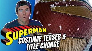
First Look | David Corenswet's Superman Costume & Film Title Change
Комментарии:

Was watching my notifications for you to post!
Ответить
The dude abides
Ответить
Christopher reeve didn’t need a muscle suit right?
Ответить
Its darker just like Henrys why the heck did he kick Henry! he loos a gazillion times better as superman and embodies everything of the character in real life and it had the emotional punch that would have worked so well - bringing him back! bleh... also kingdom come is a niche logo not the Superman logo I want! pffft anyways since how he treated henry am not paying to see it anyways ...
Ответить
I absolutely love it. Don’t care that it’s like the Kingdom Come logo, it’s alien, it’s vibrant and I love the textures!! Can’t wait to see the full suit
Ответить
Looks like the emblem is flush with the rest of the chest and doesn't portrude like Cavill's, Routh's, or Hoechlin's
Ответить
Yeah, that’s lookin great. And they’re finally hitting principal photography!
Ответить
I'm glad it's got some colour to it, reminds me of the comics.
Ответить
I just don't like the asymmetrical look of it one of the yellow panels is raised the others down on the sunken in
Ответить
Im honestly okay with them taking inspiration from the Kingdom Come logo with slight alterations. This gives Gunn room to grow this character and hopefully do a live action Kingdom Come storyline one day. Love Cavill and Man Of Steel but Im quite looking forward to seeing how this plays out!
Ответить
This is going to be amazing! I love the colour and texture, the Kingdom Come logo isn’t my favourite but it’s cool. I prefer the classic symbol. Calling it SUPERMAN makes sense, though not calling it Superman: Legacy is going to take getting used to.
Ответить
I prefer the Man of Steel suit better but it looks decent.
Ответить
Looks like Zack's.
Ответить
I like the logo but hate that the border is yellow and not red. Red bordering blue was always a better choice.
Ответить
I hate the symbol. But at least he's not covered in hexagons or little S's.
Ответить
I don't see a fully shoot on the outfit until Comic-Con or when we get our teaser trailer at Comic-Con because you know that's going to be closed tight set and no one will be allowed to take pictures. So I'm thinking either at Comic-Con DC fandom. We won't see the suit until then, but I do love the crest
Ответить
They could even call the movie "Blue Harvest"
Ответить
No alien suit technology then ,I wouldn't be surprised if Ma Kent is responsible for this.
Ответить
You do understand that just bc a movie is good does not mean YOU will like it right? Ppl flippantly say good when they mean personally enjoyable.
We need to be more precise with language, just how ppl conflate "dark" with serious. Not the same or even necessarily related

It's a mix of Kingdom Come and Earth One with the gold borders.
Ответить
Let's go 🦸🏻♂️
Ответить
I really like the S shield's basket weave texture, because I feel it could be a nod to those farm boy origins. I obviously don't know yet if that's intentional or not.
Ответить
I try not to read too much information in movies that I'm anticipating highly. This is a good reveal, not too much info. I leave myself open to Gunn's interpretation. I am glad he's changed the title to simply 'Superman'. The legacy title and the seemingly numerous characters worried me as being too much and maybe not enough superman.
BTW, Chris; on both this channel and your original; when I click on your instagram link it seems to go to a different user. Still a cosplayer but female, just fyi. I was trying to find more news on the Reeve suit you had acquired.

Hmm... snow. Superman: Frozen Empire. Can't wait.
Ответить
This was a PR move by Gunn and a good one. Buzz has been mixed at best about Superman Legacy with a key controversy being is it really a Superman film or a DCU Showcase film. Legacy implied that the DCU heroes like those in SL will learn from Superman but then go on to build the DCU without Superman. Just his inspiration. WBD has to fix that negative PR in order for Superman to have a chance at the box office. Good move but more is needed. Corenswet needs to be the PR face of Superman and not Rachel or Hoult. Hoult is giving the first interview of a cast member from Superman to Michael Rosenbaum soon. Corenswet should have given the first interview. Of it's a Superman film Corenswet should be the dominate PR face. Not that the others can't do PR too, but it has to be led by Corenswet.
Ответить
I'm not huge on the textured look. I think they should have kept it closer to the Christopher Reeve suit and almost make it 50s themed
Ответить
RED SHORTS R BACK ,no big deal but it would be nice if they set tone of the film in the 1930’s but we all know that’s not going happen.
Ответить
James Gunn is creative on his movies but yet he can't come up with his own logo for Superman like come on Zack Snyder did it
Ответить
In James gun we trust, we need Superman to carry Dc with a great first film
Ответить
Still bummed about how we got here but it is what it is.
The new symbol is working very well for me. It's a nice vibrant red and yellow. Vibrant blue suit. It looks like they are going for a big emblem on the chest.
None of this let's make the emblem super duper tiny(MCU Spider-man), barely visible(TDKR Bale suit), or non existent(MCU Daredevil).
This though is the first live action suit to use a yellow border as opposed to terminating at the red. Kinda want to see that inner yellow black now.
The title change?
The Batman and now Superman. Makes internet searching difficult but at least everyone knows what it is.

Im not a fan of the kingdom come S but the way I’m (and many others are) interpreting the crest is that it is an alien symbol that happens to look like a S. Though the colors are great, I dig the yellow trim around it, and that texture haha. Now let’s hope we get some trunks on this suit🤞🏻🤞🏻
Ответить
Would have been cool if it used the max fleischer superman colours for the emblem
Ответить
Gee how original!! 🙄🙄 So the suit won't look plastic like Cavil's, it'll look rubber like The Amazing Spider Man's?? How awesome....not!
Ответить
Just wondering what you mean by "he's had his ups and downs". Were you speaking about his personel life? Cause i can't think of a "down" he's had in terms of the movies he's directed. They've all been pretty much bangers. Just genuinely curious.
Ответить
I love the symbol so much! Not a big fan of the yellow outline but it'll grow on me!
Ответить
does he care? he changed Star Lord's background from the comics, changed Drax from the comics and he told John Cena not to read the comic books for PeaceMaker lol wtf
Ответить
I'm fine with it. But the belt better be yellow or gold. Always disliked the change to the red belt. Way too much red.
Ответить
This looks horrendous. How do you go from such an amazing, beautiful, intricate, detailed suit design in man of steel to this basic, boring, simple cheap plastic looking suit? 🤷🏻♂️🤦🏻♂️ this is basic a f 😂
Ответить
Love the yellow outline. Awesome choice
Ответить
Look bro love your videos they're good but I've got to disagree with you James Gunn does not give a s*** about his actors he screwed the best Batman in the world Michael Keaton where's the Batman beyond movie we was promised with Michael Keaton no James going don't give a s*** about his actors he's ruining DC comics
Ответить
The basket weaving suggests to me that they wanted it to look Earth-made. Like something Ma Kent could have done.
Ответить
Cavill all the way
Ответить
Still isn't Henry no thanks
Ответить
Cavill is my Superman Always
Ответить
In Henry Cavill's "Man of Steel," the director made him take off his shirt just so everyone knew that his muscles were real, and he wasn't wearing a bodysuit. The same thing might happen in Corenswet’s version?
Ответить
Cool if the rest of the suit looks like your cosplay with the diagonal cape attachment.
Ответить
I would love it if the DCU Suoerman costume design is close to Christipher Reeve classic look.
Ответить
All time favorite 😊😮❤
Ответить
