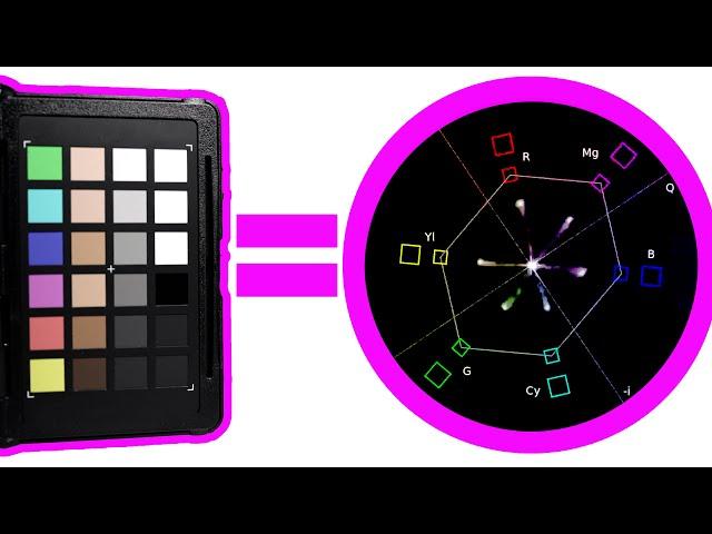
Color Correction In Premiere Pro Using A Color Card (Premiere Pro Color grading tutorial)
Комментарии:

I was taught CIE*Lab based color science in 1975 by the guy who invented DuPont’s CYMK pre-press proofing system. I was working in the photomechanical lab of National Geographic at the time and one of the beta testers. My next job was as production manager Judd&Detweiler a web offset magazine printer which had been involved with creating the SWOP CYMK color gamut which stands for “Standard for Web Offset Proofing / Printing. What does this have to do with using a color checker in an RGB only workflow? Being aware of that all the colors on that chart are selected based on their ability be reproduced on a printing press with CYMK ink combinations.
Color spaces are depicted on 2D graphs and vector scopes but their Lab coordinates actually describe a 3D object. If you use a Mac open System>Utilities>ColorSync Utility and select a color space gamut. That application allows it to be visualized in 3D by rotating it 360° Clicking the small ^ triangle on the upper left will allow you to compare the first gamut you select with a second.
If you select sRGB and then SWOP CYMK you will see and understand the problem printers had with client back in the days of uncalibrated sRGB gamut monitors. The CYMK inks used on magazine presses just can’t print some of the deep blues and purples the sRGB monitor could display which caused magazines to demand free re-prints of ads because the colors didn’t match what they saw in the original transparency or proof the color separation house who scanned it provide.
Next compared AdobeRGB 1998 with SWOP CYMK. The two of them fit together nearly perfectly. The SWOP CYMK gamut didn’t get bigger, Abobe when adding CIE*Lab color management to Photoshop with V4 designed the Adobe RGB 1998 gamut with less saturated blues and purples than sRBG has. The Adobe RGB 1998 standard was actually an existing HDTV gamut the television industry had established for CRT monitors.
If shooting photos or video which need to match colors in printed clothing catalogs or those on web page constraining the colors to the gamut of the color checker chart will ensure colors in the images will match the dyes in the clothing which were also standardized in the 1970s to not exceed the SWOP Gamut of the presses which printed clothing catalogs.
On of my tasks as production manager at a web printer in the late 70s was educating the magazine production managers about these so they would reject advertising materials which were not proofed to SWOP standards. Once everyone understood the need to conform to what the output device was physically capable of producing the expectations of magazine designers and advertising clients were more realistic and requests for free re-runs of ads much fewer.
That is the reason the color charts were created and what they actually do. The goal is allow the color in the images to look the same regardless of how it is seen—screen or print—and is more critical in RGB > CMYK print workflows that RGB capture > RGB screen output.

I still dont understand why on earth the luma scopes have the markers so far out... makes no sense to me as the colour is clipping HARD before then. Why not have a 'about halfway' marker? Honestly it's such terrible UI/UX I'm amazed it hasn't changed in so long. Moreover, why hasn't this been automated yet like it has in DaVinci?
Ответить
Gonna try this with my Colorjacker
Ответить
this is a great video, thanks so much for taking the time to make it.
Ответить
brilliant!
Ответить
Very good.
Ответить
So helpful wow!
Ответить
What about if you're using a Red Komodo? do you have a rec709 lut out? Maybe a dumb question
Ответить
Thanks 👍👍👍
Ответить
Pretty cool. My ProRes Raw shot looks amazing now! Thanks :)
Ответить
Super helpful, thank you!
Ответить
great video; thanks for sharing!
Ответить
Whats funny about this video is the skin tone on the card looks way better than the skin tone on the person. The neutrals are PERFECT,....this was exposed correctly using the correct lut at the correct ire....but i think an extra step is needed to just match actual skin tones with the ones on the chart
Ответить
Thanks for this tutorial, it was very clear!
Ответить
wow thanks odd as it may should it was hard to find this info on then net. great tut
Ответить
I’m curious, why did you adjust your middle grey to 41? That’s the IRE value for slog3 but you’d already applied the lut to be working in rec709? You put the white bar at 90, which is the 709 value. Am I missing something 🤷🏻♂️
Ответить
the only downside with the card method you cannot get any benefits from it in harsh weather conditions or sunset, sunrise senarios
Ответить
Why there is no plugin or official program like in DaVinci Resolve - when you do it i 1 click all corrections :(
Ответить
Good explanation. Thanks
Ответить
Great tutorial - exactly the video I was looking for to help with my new colour checker! Thanks.
Ответить
Just NAILED my color correction thanks to you, Jason. Thank you!
Ответить
Thank you this video help me so much 😁
Ответить
Excellent tutorial, straight forward easy to follow. Helped me match two vastly different cameras - a blackmagic micro cinema and a canon xa40.
Ответить
Thank You Jason for so so great video !! Best tutorial for Color grading.
Ответить
Do you know how to add a adjustment layer to a single layer and not all? I do green screen and I dont want it to color correct my background.
Ответить
Very helpful!👍♿
Ответить
After hours searching, I FINALLY FOUND YOU!! THANKS!! (sorry for the upper cases, i am excited and happy!!)
Ответить
Hey Jason, I filmed in S-LOG3 although ordered the photo color card. I'm a little stuck at how to isolate the color checker as the two leaves of the x-rite in the shot are white and grey (followed by the next page which is color boxes.) I appreciate the advice.
Ответить
results are better before cc XD
Ответить
Nice work Jason
Ответить
Thank you Jason! Great lesson
Ответить
YO! This is one helluva tutorial. Thank you Bud.
Ответить
This is the most helpful coloring video I have found! Thank you Jason!
Ответить
Use the MBR Color Corrector instead
Ответить
Excellent video!! This is the most simple explanation I’ve seen using that product…and I’ve watched over a dozen!!
Ответить
That video is enormously bad for me. Now i need such a card and more time to correct my video "foodidge" ;)
Ответить


![[4K] Yoga Flow in See-Through Leggings | No Underwear [4K] Yoga Flow in See-Through Leggings | No Underwear](https://invideo.cc/img/upload/VURFU0hJck8xemU.jpg)


