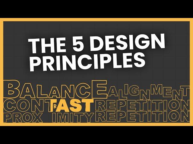
The 5 Design Principles (But in Web Design)
Комментарии:

So, I spelt contrast wrong in the video. Please forgive me
Ответить
You're creating amazing content that's quite helpful in real life. I visited your site but to my surprise, I can't find any good websites with the principles/techniques that you're telling. Neither the pricing that you've mentioned matches the type of work you've listed in the portfolio section. Please tell me if I missed something? I've following you for a long.
Ответить
This video was super helpful! I'm new to website design, and I was making some major mistakes. Thank you!
Ответить
I really wish you didn't use profanity in the videos so I could recommend them to my high school web design students to watch.
Ответить
The end result of this advice is clone after clone of the same site design. How boring is that?
There is no mention of developing a "house style", whether through any one of the 5 or some of them in combination. The biggest problem with having what you might call a fluid style ends up as having no style (individuality) at all. The first impression that any site gives has to be based upon building almost immediate trust. Are visitors immediately going to judge a site on any one of these design principles and reject it if it fails on one or more? I doubt it. Sometimes a site can be too slick and that can be a red flag to me.
When you end up with just a clone of everyone else's style, you'll suddenly find that there's a nagging need to overcome the boring, so, it's back to the drawing board. However, when you design with a particular style in mind the later need for (regular) overhaul rapidly diminishes. There are several styles that are "timeless". The emphasis can then be to concentrate upon the most important thing: content!
Back in 2004 I began what I knew would be a painstaking project. What I didn't know was that it would keep me busy for 20 years! Quite apart from receiving quite amazing feedback, I'd also flow from designing in tables, through floats and various HTML flavours and along the way there would be PHP, JS and CSS to try and master. Right at the start I adopted a particular design, apparently something considered as "classic" in the world of paper. I also knew that the navigation would be key, so that had to be settled upon pretty early too. Making key navigation modifications is a recipe for total disaster, so best avoided at all costs.
There were other considerations. With my subject being a famous art-deco ship, back in those days use of fonts/typefaces beyond a limited few could not be counted upon as part of my intended "house style". I would have to convey my deliberately dated look through other means. Layout design would be key to this! At the time of my transition from tables to CSS I can remember having furious rows with the "cognoscenti" because I had refused to adopt what was then seen as "modern" styling. There are many reminders of this throughout your presentation, hence my stepping in with my 2pworth. Was I about to adopt this about a ship that had foundered in the 1970s? Nahhh...
So where am I now? Well, the site has grown to around 1,100 pages, many of which are passenger or crew lists that carry up to the equivalent of 32 or more A4 pages. Add in around another 400 support pages, in slide-shows, quizzes and a whole bunch of text transcripts. The greater majority of the 10k images are of enlargements of text - programmes, menus etc., so the transcripts help resolve an accessibility issue. The site generally confuses software like Wave that insists much of my content should be laid out in headings - like for the days when the only information I have is the vessel being "At sea".
I recently had a look back to my first HTML pages, all laid out in those danged tables. The differences between then and now in terms of presentation are very few. I believe it's described as a "classic report style" and its definitely NOT balanced. The navigation, apart from the modest expansion of key indexes, is almost identical to back in the day. The key question being, do I feel any burning need to change the presentation? The answer to that is a resounding: No! I'm not sure that I'd be so definite with my answer if I'd listened to those critics I mentioned.
There has been one absolute constant throughout, from AOLPress3 right through to VSC - everything has always validated. Other standards, like those set by W3C, have also been followed, though not slavishly. TWA, your speelin blunder is forgiven. I watched your video because I'm always up for learning something new, though I'm sorry, I'm not drawn to your clone-reproduction suggestions...
Regards,
Peter S.
Caronia Timeline Webmaster

I'm glad you said you didn't give a fuck about these principles, bc it's such a gray area for me. I feel like these principles are a failed attempt to add rigid rules to design..or at least to describe in words what people find visually appealing. Maybe my problem with it is the use of the word "principles" instead of something like "guidelines" or "suggestions."
You mention "there's almost a subconscious effect" – I would argue it's almost all subconscious, in fact, the primary goal of UX is to organize information in a way to doesn't make people stop and think.
When I look at a design I like, I don't think, "Oh the use of proximity is immaculate!" Rather than adding the picture of an elephant on the page titled zebra, put it on the page titled elephant because that way users will understand the correlation. Brilliant! 👏
It's a blend of common sense and evolving trends which became expectations. Over time trends evolved, certain things caught on, people recognized the patterns and now they expect those patterns. It may not always be "better," but it's expected by somebody who is familiar; on the other hand, if you take someone from Japan, whose design expectations are completely different, they'd be lost. Does that mean their design is bad? Japan is certainly an outlier, but it's an interesting question – there's a great video on this called "why Japan's internet is weirdly designed".
Anyways – I appreciate your video and honesty.

I'm a beginning UI/UX designer, and while I did find some of your tips useful... you make these very dogmatic statements as if you are the creator of web design. A lot of your videos are expanding emphasis on bad websites and spending very little time going in depth on the good ones. I've watched 2 of your videos and have decided to move on to another channel because there's little information about HOW to do the methods. I need strategies, solutions, and answers. Not criticizing and critiquing.
Ответить
✍️ CONTAST ✍️
Ответить
Your content is really good. Informative, well structured, crisp, practical and actually useful. Thank you. ❤
One other thing, can't you use the acronym 'B CRAP' for the basic principles? (Because is sounds like be crap, obviously 😁)

Great video! Thank you for posting.
Ответить
I like your video presentation. It is informative too, at the same time. Thanks a lot for your guidance!
Ответить
In contrast, great video
Ответить
CONTAST
Ответить
Contast. 😅
I'm watching this twice cos there are a lot of good points and I need improvement in all 5 principles.

Very much appreciate your content, take care sir.
Ответить
Thank you. This was very informative and exactly that I was looking for. Definitely I will check your other videos. Once again, thanks.
Ответить
This is such an undervalued piece of content, great job.
Ответить
I guess what you're sharing here is B CRAP 😂
Ответить
Plot Twist: He's a genius and he knew we would all comment about the word CONTAST, increasing the engagement signal for the video.
Ответить
love this channel. informative but fun... in a deadpan kind of way.
Ответить
Funny and good stuff!
Ответить
The information is so great and the videos perfect. And it’s such a shame that they don’t make a “start here” playlist with all the beginner level stuff — I would totally binge watch the list.
Ответить
binge watching all your vids! love them, learning a lot
Ответить
Thank you for being informative and down to earth.
Ответить
Very helpfull 🙌
Ответить
Contast is importatn
Ответить
Thank you Aaron, great straight forward content. Much appreciated.
Ответить
Underrated channel. superb quality and content.
Ответить
contast
Ответить
You put contast instead of contrast
Ответить
Super informative and entertaining. I like your presentation style and humor.
Ответить
You inspired me to buy "Don't make me think revisited by Steve Krug." I read it cover to cover. It was really enlightening. Thank you.
I also bought most of the books that Steve recommended, such as "The Design Of Everyday Things - by Donald Norman" and another book about web forms.
I have a stack of books now, and I've been making progress on reading them while I lie awake at night. I wanted to share.
I hope you continue making videos. You have a niche that people need to hear. Your logical approach reminds me of another content creator I watched and learned so much from.

really loved it 🤩
Ответить
10/10
Ответить


