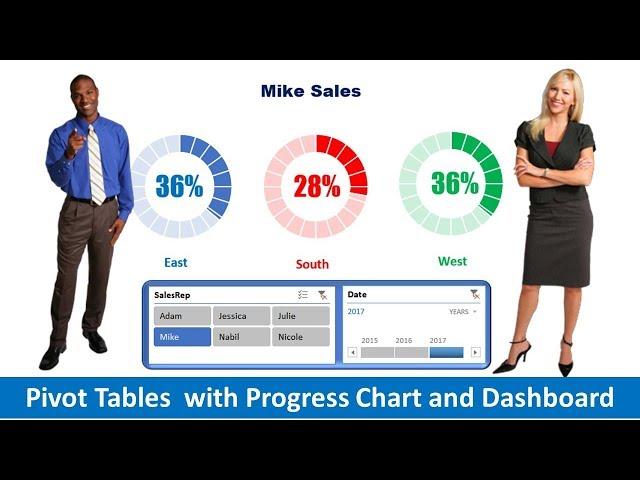
Pivot Table with Progress Chart and Dashboard
Комментарии:

Plz share practice file
Ответить
wonderfull
Ответить
Very clear
Ответить
Excellent…!!!👌
Ответить
Good job sir! Straight to the point explanation. Thank you!👍
Ответить
Thank you
Voice is soothing and you speak at a pace to understand/follow.

😊ñn
Ответить
Simple and excellent, to the point!
Ответить
Totally useless & pathetic video
Ответить
Thank you so much. Very simple and clear explanation running through the video and same time action taking place on laptop
Ответить
You are pretty awesome aye. Ka pai brother
Ответить
Wow, mindblown. Thank you!
Ответить
good job
Ответить
it is to late to ask you after 4 long years to upload the excel sheet once again
Ответить
Great job! Thank you so much.
Ответить
Can you support same Part code & same customer we supplied different price in past 5 five years, I want take report for this, while making pivot its coming sum value and tried max & minimum in cause of if its two different price we can use, but supplied three different prices how to take report, I failed evert time, anyone can support...!!!!!!!!!!!!!!
Ответить
Awesome explanation. I am very greatful to you. Thank you.
Ответить
excellent.
Ответить
Brilliant. I followed and it was like a walk in the park.
Ответить
You are Just Awesome. Thank you tons for this.
Ответить
J
Ответить
The best Ms Excel tutorial I've come across 💯. Thanks
Ответить
minute 4.12. i cant put % in the column..if i do, the 26.16% will be 2600% then..please help
Ответить
great
Ответить
Thanks again✔✔😎😎
Ответить
A very nice tutorial. very simple explainantion. Can you pls explain how you are able to select only one name from the slicer Salesrep??
Ответить
Bravo, you did it. Thanks a lot.
Ответить
Fantastic Job. Well presented.
Ответить
this is .... noyt carttoon i want carttoon
now

Thanks for this!
Ответить
Excellent tutorial. Thanks
Ответить
Hi Thanks for the amazing video on donut charts, however can you please explain what if the %revenue is 100% and above, how would the chart look like?
Ответить
Tx sir
Ответить
Thank you so much, its really amazing. however, I tried linking text box to the pivot table but could not get it even after following the same procedure. please is there anything that one need to do?
Ответить
No option, but subscribe and tumbs up. With thanks!
Ответить
Very nicely explained..... Thanks for the tutorial
Ответить
Is this required for data analysis job?
Ответить
Wow beautiful video ❣️
Ответить
This video is very helpful for me, thanks for this video
Ответить
Thank you so much
Ответить
thanks for sharing. Very interesting. I tested with my fake data and had one problem. When there is any value 0 the chart gives 100 % meaning for example if East sales are in February 0 the east chart shows 100 %. I found a solution adding a date (example east date 01 fabruary 0 sales, in the source data) but this is not easy when it comes to huge data. How should I fix this ?
Ответить
EXCELENTE!!!
Ответить
thank you for sharing
Ответить
Very good so i don't understand speak english
Ответить
Thank you very much for this amazing tutorial.
Ответить
@Officeinstructor, currently only the starting version of your Excel file is available in the linked Amazon Drive folder. Could you please provide the completed file again as well?
Ответить
Awesome , thanks for a very good and helpful presentation
Ответить


