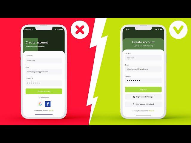
Amateur vs Pro: Advanced UI Design Examples (Before & After)
Комментарии:

I plan to make more of this kind of videos and start a new series, potentially where I would do a reviews and redesigns of your works, but... I need to know if you like it, so hit that thumbs up button. I will give it back after 10k subs :D
Ответить
This is awesome! It's educational for beginners like me to see the thinking behind each design. Love it!
Ответить
All were good except the first one in my opinion.. the secondary buttons looked a bit too much like the input forms..and the use of fb and google colors made it clear on landing what that section would do..I also find that the cta got more attention in the first one because of the white space.. also the header popped more because of the placement of it above the block..
Ответить
Hats off to the creative mind behind this design – it's a true reflection of innovation and style."
Ответить
That was a great video man, really well made 👏
Ответить
Thank you very much! I think it's important for learning design to not only see outright bad examples, but also good or viable ones, as well as how to improve them further. Wouldn't have thought to make the buttons have short and consise text, for example. Or the stage tracker. Or text buttons instead of logos. Very interesting
Ответить
Thank you Kerev! Its very clear explanation for the improvement. 😊
Ответить
Please make more videos like this
Ответить
This is Gold for me Kerev, excellent analysis 🤩
Ответить
Wow, I love this. I'm going to apply them while working. Thanks
Ответить
First video i've seen of yours, i really like this before and after style. Short and sweet
Ответить
Nice episode ✌️
Ответить
In the Second Example , You put the linear Gradience in FIGMA ? Or PHOTOSHOP
Ответить
This was really helpful. Thanks!!
Ответить
Awesome! 🤩
Thanks

Hi! If i want to ask for feedback to my design, how should i reach out to you?
Ответить
Im surprised by how well you understood the "failed" designs. I wouldn't have understood wtf "01.03" was about (date?? Wtf)
Ответить
the details make or break a design awesome video
Ответить
Amazinggg
Ответить
Awesome! 🤩
Ответить
Nice, but for the first design, I'd also color the Google and Facebook icons.
Ответить
i like it really
Ответить
thankyou so much! this video needs more views..
Ответить


