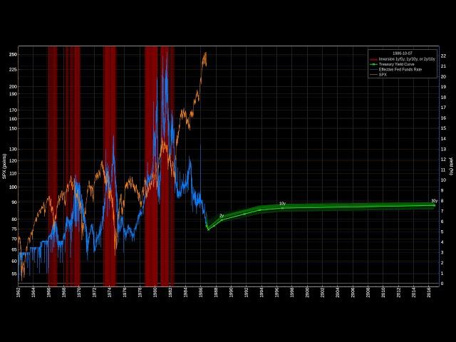
Animation of the US Treasury Yield Curve with Inversions from 1962-01-01 to 2019-04-01
The dancing green line plots the yields of all constant maturity treasury notes.
The trailing blue line shows the efficient 30 day Federal Funds rate.
The orange line is the broad stock market SPX index.
The background of each day is painted red if an inversion of the 1y/5y, 1y/10y, or 2y/10y yields occurs. The darker the red color, the greater the inversion.
Watch the yield curve and the stock market index change over the decades, notice their behaviour in times of crisis. The video ends with the current inversion around April 2019.
More about the yield curve and inversions: https://en.wikipedia.org/wiki/Yield_curve#Inverted_yield_curve
The Federal Funds rate data was taken from FRED (Federal Reserve Bank of St. Louis), series DFF: https://fred.stlouisfed.org/series/DFF
The US Treasury yields data was also taken from FRED, series DGS1MO, DGS3MO, DGS1, DGS2, DGS5, DGS7, DGS10, DGS20, DGS30, e.g. https://fred.stlouisfed.org/series/DGS30
Across the decades the various durations were sometimes not emitted, which is visible by points being added or removed from the green curve.
SPX data was taken from Stooq.com, series ^SPX.
Тэги:
#yield_curveКомментарии:
Skatepark Wasserburg am Inn
Tom Cat Skateboarding
Нью Джерси Дэвилз - Нью Йорк Айлендерс Обзор матча 16.04.2024
NHL HOCKEY CHANNEL
BIG NEWS REVEALED! PREMIER HIRING SECURED FOR STELLAR TEAM! GOLDEN STATE WARRIORS NEWS
Warriors News Fan Update
Aşk ve Umut 91. Bölüm
Aşk ve Umut
Far Cry 5 (Part 1) My first Far Cry game!
Meghan Yeah
Чайки 2015
Kosmos 08


