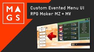
Custom Menu UI for RPG Maker MV / MZ, Custom Evented, and JavaScript Menu Scene
Комментарии:

Your able to do all this because your a game UI Developer Professional. But how would any of us with a half assed idea of a game never made make it look good and interesting!?
Ответить
This is the worst guide to creating a menu I have ever seen.
Ответить
You ramble way too much and damn, the diction is horrible.
Some people arn't make to do videos :s

Is this code / menu stye available for purchase or download anywhere?
Ответить
how do u show variables?
Ответить
Wow, how did you get your character to have gridless movement? It's so cool!
Ответить
I'm a bit scared that making a parallel common event for the menu would make the game lag or too heavy. Do you have this kind of problem ?
Ответить
thank you so much for this. If you have any suggestion for reworking the save scene let me know! Trying to learn to do that now xD
Ответить
i wish i could see a little more detail in how you did this. more specifically how you integrated existing rpg maker menu stuff in. any recos for tutorials or other videos where you share a little more behind the scenes? looks great!
Ответить
😆
Ответить
THIS IS COOL WANNA KNOW HOW TO MAKE IT
Ответить
That's menu looks so basic
Ответить
Almost looks like how we go about it in RM2kX
Ответить
Them menus bruh! Looking snazzy!
Ответить
Awesome Interface! Teach us how to use PIXI!!!
Ответить
Just wanted to say that it's always a pleasure stumbling on these videos. Helps keep me motivated to see other people working on their games. Glad you're still going strong on this. All the best!
Ответить
Nice work!!
-corpsejackmenace


