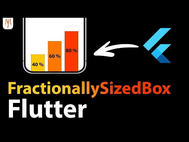
Flutter FractionallySizedBox (Responsive Design)
Комментарии:

why should we use FractionallySizedBox...when we can get the same effect using Container with MediaQuery?? is their any specific reason?? Thanks.
Ответить
I have a general question not really related to this video...
Is this the best approach to a component you don't know if it will have to be scrollable?
body: (
child: SingleChildScrollView: (
child: Column( everything else... )
)
)
If not what is? 🤔

Hii, can u make a video on pedometer
Ответить
Awesome 💙
Ответить
Hey,
könntest du vlt ein Video dazu machen, wo man zweit Items (zb. 2 Boxen mit einen Pfeil verbinden kann)? also wie zb bei einen Chant Chart.

the prefered way of sizing widgets is this:
1. dont size your widget.
most widgets dont need a size. they can simply take up the space they need.
if your widget needs to span a width or height of some other widget or even the screen, then you can simply use a Row or Column with an Expanded.
if your widget needs a size, then:
2. give your widget a Logical Pixel size
logical pixels are the size measurement that flutter uses.
Container(
height: 40,
)
this container has a height of 40 Logical Pixels.
Logical Pixels promise you that your widget will have the same physical size on all devices.
this means, if your widget has the size of a 50 cent coin on your device, it will have that exact same size on all devices.
if you really need to size your widget depending on another widget it is in, or the screen*, then:
3. use a LayoutBuilder
a layoutbuilder will delay its own build until its parent is built, and then pass the constraints of said parent to its children. that way, the children can then build themselves depending on the size of the parent widget.
if the parent widget spans the entire screen, then youre basically sizing depending on the screen. DO NOT use this to multiply the size of your widget. that is not a good plan.
MediaQuery should be used to show different layouts of your screens depending on device size. It should not be used to scale your widgets directly.
-class spider extends arachnid

🔥
Ответить
bro
Ответить
Wow this one is truly useful!
Ответить
Hello Johanne,
I need ready templates online to fix with any project/integrations. Please advice best websites. Thank you.

Johannes, you are outdoing Google in explaining Flutter widgets. Quick, simple, outstanding!
Ответить
This is very useful 👍
I have been using MediaQuery to get the width and height then multiplying by the desired percentage. However, this seems much easier, faster, and less code.

Very useful 👍👍👍
Ответить
Great videos.. Keep up the energy
Ответить


