Data Analyzer Tutorial | datapine
See our data analyzer in action and learn how to visualize your data with a few clicks to generate new insights.
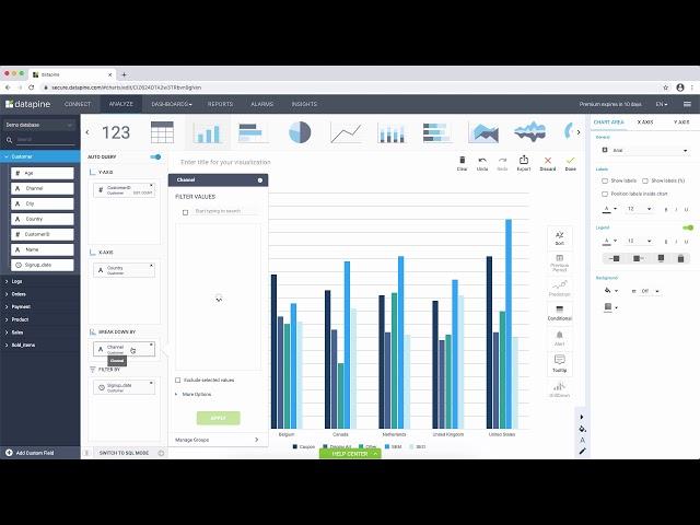
In this short tutorial, you will learn about the 3 main areas of datapine's analyzer, to help you create charts and KPIs quickly and easily: data source structure, chart creator, and chart designer.
The data source structure will enable you to select the data you wish to visualize from a simple drop-down menu where you can see all your connected data sources. From there, you can simply drag-and-drop your values in the chart creator and customize further.
On top of the analyzer, you can choose from over 25 different chart types to change your current chart such as the bar, pie, stacked, etc. Additionally, you can use the chart designer to change the appearance of your current chart.
For advanced data analysis, more options such as custom sorting, comparing to previous periods, conditional formatting, alerts, tooltips, drilldowns and predictive analytics options are available as well.
An extensive expression library will enable you to add new fields to your data source and perform even more advanced analysis. With these expressions you can manipulate or clean your data, or you can virtually add new calculations, that did not exist yet in your database.
► For more information about our state-of-the-art data analysis tools, check out our website:
https://www.datapine.com/
► If you want to try a professional data analysis software 14 days for free, start your free trial:
https://www.datapine.com/registration/
Тэги:
#data_analysis #data_visualization #business_intelligence #visual_analyticsКомментарии:
Data Analyzer Tutorial | datapine
datapine
THE BEAUTIFUL LIFE | Kitchen Organization
Karl Anthonii
Гинекология детского и подросткового возраста
Клиника Медицея
vida de inseto creditos
OAKLEYGAMER
Cordoba C5 Classical Guitar: Quick Review
Powercoat Music


