Комментарии:

Its been 8 years with what i call, Material Roboto, and to me, it feels really stale and boring to me now.
It's probably since Roboto has been used... welp, pretty much everywhere on most Android apps. Im glad they're changing the font, but there's still something about Material Roboto... i don't know what, but there's something that makes it feel... well, androidy.

Reading this in roboto, while making a website that uses roboto in VS code and using the roboto mono.
Ответить
Little did anyone know the Android font began creeping to civilization
Ответить
Roboto is a special font for Android system. And do not print sheets.
Ответить
Release date: May 21, 2015
2015-Present

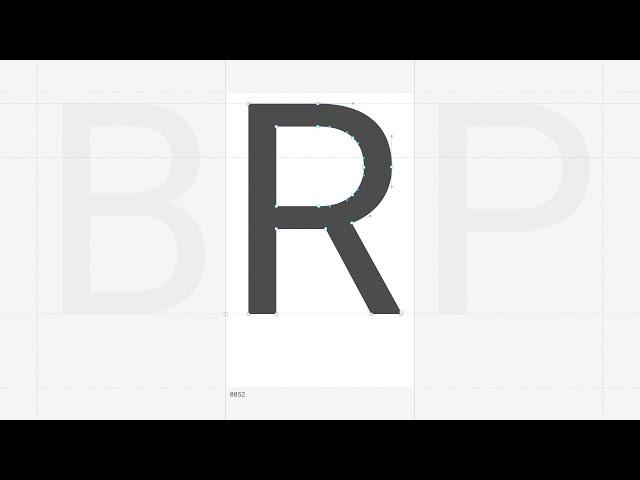
The new Roboto
Ответить
roboto supremacy
Ответить
Used in Google
Ответить
I am using Comic Sans everywhere. Any other font I fix 'on screen'.
Ответить
thanks for this concept
Ответить
156raviroadkarimparklahore
Ответить
im reading those comments in the old roboto
Ответить
My inner type geek, it satisfied with this
Ответить
The best neo-grotesque sans serif font that I am using.
Ответить
font-family: "Roboto", "Helvetica", Arial, sans-serif;
Ответить
wow my recent apps clear icon got circle animation while touched
Ответить
Joel
Room

What software did Christian use to create the Roboto font?
Ответить
The numbers 6 and 9 are looking like crap in this new version like they were copied from the Myriad font
Ответить
Love the detail in the videos!
Ответить
Ah, so this is why Roboto lost its fizz. It's not Roboto anymore.
Ответить
Love Roboto font!
Ответить
When will you publish updted version on google font? I really like the new one.
Ответить
"LET'S REFINE THIS FONT, THEN USE THE OLD UGLY ASS VERSION FUCKING EVERYWHERE, INCLUDING NATIVE APPS THAT ARE SUPPOSED TO BE MATERIAL AND ALL OVER THE DAMN PLACE IN THE KEYNOTE, BECAUSE FUCK CONSISTENCY."
Ответить
I hate this font
Ответить
i love their music! where to get them?
Ответить
So awesome seeing Google improving the design, and i love to see the attention to detail. I feel like Kitkat and below didn't have any of that, so... great job Google design team!
Ответить
Fact: You are reading this comment in Roboto.
Ответить
roboto
Ответить
Well roboto doesn't look and feels like a balance font. I mean the width and height of every font. It looks like they are going to fall off from standing
Ответить
Ha, love the placement Josef Müller-Brockmann's book on the shelf in the background. Too bad CSS doesn't do us any favors with typography or the grid system for that matter. =(
Ответить


