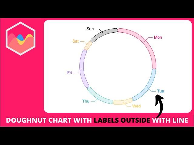
How to Create Doughnut Chart with Labels Outside with Connecting Line in Chart js
Комментарии:

Great video friend, I would like you to explain in video how to make a chart that automatically updates with data in json...thanks great video
Ответить
WOW! Very appreciate! You helped me and safe my time!
Ответить
does it work with react typescript?
Ответить
How can we achieve same in piechart. Thanks
Ответить
Hey, how to create multiple labels that not depends from numbers of data. For example like speedometer? is it possible to arrange the elements in that way?
Ответить
nice explanation , THANKS A LOT. 🙃🙃.
Ответить
Thank you for this❤
Ответить
Really great tutorial ✅✅
Ответить
how can I do this with chart js (2.9.3) - ng2 chart(2.3.2)?
Ответить
THANK YOU !!!
Ответить
i do not get the data while console.log(chart.data.datasets)...anyone have the solution
Ответить
Nice Video and really great content. Question, how can I make the same thing but with the datalabels inside each slice in piechart for example?, like when you have percentage datalabels inside each slice. Thanks!
Ответить
So one thing I can't figure out is why your x and y tooltip coordinates aren't influenced by your chart padding. Or maybe it really is. If you were to set the padding to chart width / 2, wouldn't all your calculations be off by padding x value? The tooltip coordinates are calculated from canvas edges not the chart edges.
Ответить
Thank you for the video, but i wanna know how to Create PIE Chart with Labels Outside with Connecting line
Ответить
Holy shit dude, thanks so much.
Ответить
Is it possible to do the same to chartjs 2.9.4?
Ответить
When there is small and very large datasets labels overlapp, what is the solution for that
Ответить
Well, when i use pie, the tooltip far from the side, how can i change the position of tooltip (Side Pie)
Ответить
Nice video man!!! I want to ask how can I get the lines to start from the centre but on top of each slice, right now it starts at the centre but from inside each slice, thanks!!
Ответить
Awesome, wonderful ... no words!!. Excelent explained!
Ответить
Thank you for the video. It's of great help.
I have a question though - when the slices of the Chart are small, the labels are overlapping with each other. How to fix this? Kindly respond.

Thank you very much the way you explain step by step and very simple to understand.
I am facing issue in this. When the data points have big difference like: data: [3, 2, 1, 100, 105] then labels are overlapping.
Please provide some solution.
Thanks

Excellent tutorial! thanks. But how do I show the data in percentage instead of the label?
Ответить
Thank you for the video. It's great help.
I have a question though - when the slices of the Chart are small, the labels are overlapping with each other. How to fix this?

Hey... Could you please help me on how to use this technique with ng2 charts in angular 15? Is there any work around for that?
Ответить
Would you mind to publish this plugin as an npm package?
Ответить
life saver
Ответить
In my dashboard I need multiple charts in the same page with different values. How can I do it?
Ответить
Thank you very much learned much, thanks for explaining it so well and taking the time to make these videos. I Appreciate it, thx.
Ответить
HI this was a nice way and I have implemented this and worked but in my page I am destroying the chart and rebuilding again . When this happens the font of the text shown is becoming bolder . How to solve this ??
Ответить
thankyou
Ответить
Nice.
I have a little issue, in my doughnut chart.
I have a lot of data and little slices, the label outside overlaps each other, how can avoid overlapping?

why when I select a legend to hide the dataset (checked that the condition hiddenIndices is satisfied to hide the line and text), when I turn the legend back on, it doesn't show up again?
Ответить
Can you post a link to your code please?
Ответить
please provide me final code it look complicated i will just copy past it.
Ответить
You made me so happy with this video I literally cried tears of joy when I finally understood the gimmick behind the idea, thank you SO much, I do mean this
Ответить
CODE
const doughnutLabelsLine = {
id: "doughnutLabelsLine",
afterDraw(chart, args, options) {
const {
ctx,
chartArea: { top, bottom, left, right, width, height },
} = chart;
chart.data.datasets.forEach((dataset, datasetIndex) => {
chart
.getDatasetMeta(datasetIndex)
.data.forEach((datapoint, dataPointIndex) => {
const { x, y } = datapoint.tooltipPosition();
console.log(x);
// draw line
const halfwidth = width / 2;
const halfheight = height / 2;
const xLine = x >= halfwidth ? x + 15 : x - 15;
const yLine = y >= halfheight ? y + 15 : y - 15;
const extraLine = x >= halfwidth ? 15 : -15;
// line
ctx.beginPath();
ctx.moveTo(x, y);
ctx.lineTo(xLine, yLine);
ctx.lineTo(xLine + extraLine, yLine);
ctx.strokeStyle = dataset.borderColor[dataPointIndex];
ctx.stroke();
// text
const textWidth = ctx.measureText(
chart.data.labels[dataPointIndex]
).width;
console.log(textWidth);
ctx.font = "12px Arial";
// control the position
const textXPosition = x >= halfwidth ? "left" : "right";
const plusFivePx = x >= halfwidth ? 5 : -5;
ctx.textAlign = textXPosition;
ctx.textBaseline = "middle";
ctx.fillStyle = dataset.borderColor[dataPointIndex];
ctx.fillText(
chart.data.labels[dataPointIndex],
xLine + extraLine + plusFivePx,
yLine
);
});
});
},
};

Thankyou for making this video, their is another thing to the same I need multiple labels in place of single label.
Can this also be configured in the same

This has been super helpful, thank you. I'm wondering how we could apply this with longer labels, since they get cut off for being too long.
Edit: chart.options.maintainAspectRatio = false; did that for me :)

This is really nice. The only video I found regarding tcollecting the data labels with the chart. Thank you so much. It works as expected
Ответить


![Guddi Episode 02 - [Eng Sub] - Bakhtawar Rasheed - Kamran Jeelani - Maham Aamir - 21st December 2024 Guddi Episode 02 - [Eng Sub] - Bakhtawar Rasheed - Kamran Jeelani - Maham Aamir - 21st December 2024](https://invideo.cc/img/upload/TUVSRXhzMGdYRTk.jpg)


