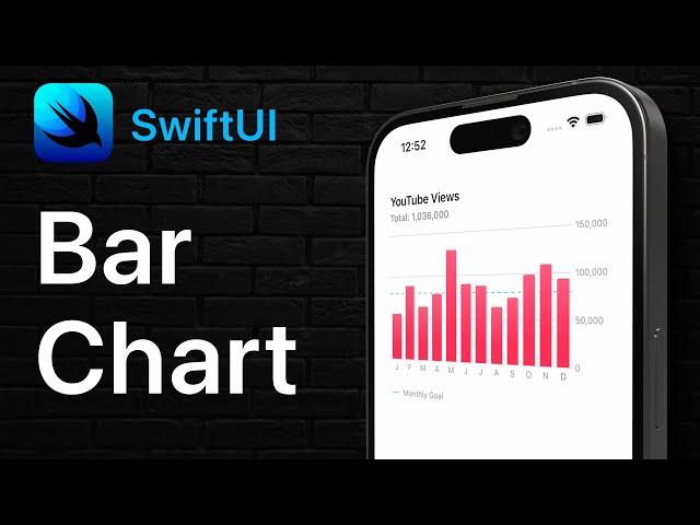
SwiftUI Bar Chart with Customizations | Swift Charts
Комментарии:

How do you make more than one chart inside the same ForEach?
Ответить
thank sir
Ответить
Awesome tutorial. Another way you can get the dashed lines in the Legend is by using Path { }. Not sure if this will keep the formatting when I post it. This way, the dashed line will be displayed matching the RuleMark, if you make it dashed like you do in the video.
HStack {
Path { path in
path.move(to: CGPoint(x: 0, y: 7))
path.addLine(to: CGPoint(x: 35, y: 7))
}
.stroke(Color.secondary, style: StrokeStyle(lineWidth: 3, lineCap: .round, lineJoin: .round, dash: [3, 10]))
.frame(width: 50)
Text("Monthly Goal")
.foregroundStyle(Color.secondary)
.font(.caption)
Spacer()
}

Dude, killer videos
Ответить
🥷
Ответить
Can't find 'Chart' in scope I'm getting an error I wonder how can I solve it?
Ответить
hi Sean,
are Charts a better way to create a weekly calendar than Grids are? with all the possible customizations you show and tease, I imagine a lot of usefull elements for building up a structure like calendars.
thanks

Hi Sean, I have tried these two solution for that last label invisibility issue on x Axis
1. AxisValueLable(format: .dateTime.month(.narrow), multipleAlignment: .centre),
2. AxisValueLable(format: .dateTime.month(.narrow), horizontalSpacing: 10)

😲 Longtime Objective-C/XCode dev - this may be the video that makes me learn Swift. That’s ridiculously easier. Great job as always.
Ответить
I wish there was a way to easily press the chart and see the exact number for each month. For when the rough estimate won’t cut it
Ответить
Instead of doing the workaround of rotating a diagonal line you could just use a RoundedRectangle
Ответить
Sean this is dope thank you! By chance, do you know if there is a way to manually set the X Axis scale instead of it just going by the data provided? For example if a chart is displaying monthly values for the current year we're in, & it's only February, the chart would look silly just having two massive bar marks representing January & February. Thanks!
Ответить
Brilliant ❤
Ответить
Great overview! This framework can be a bit overwhelming in the beginning, since it's so customisable.
Ответить
Very informative video! I was wondering if there is a way to make the charts swipable like they are in Apple's Health app? I have tried to find how to do this but I can't seem to find anyone doing it.
Ответить
🚀 Love it just started playing with this for an app. Great video! 🤘🏾
Ответить


![[FREE] West Coast x YG Type Beat - "dummie" | Free Type Beat [FREE] West Coast x YG Type Beat - "dummie" | Free Type Beat](https://invideo.cc/img/upload/Y2wwRVlTcVhnTHQ.jpg)


